
One of the most fun things about having a baby is seeing which traits they inherit from each parent. It’s fun to try to guess before the baby is born, too – for example, what eye color will my baby have?
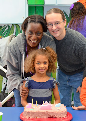
If you’ve met my family (or just looked at the picture in the post) you might not think eye color was a particularly interesting trait for us to speculate about. My wife and I have brown eyes, as does my daughter, and brown is far and away the most common eye color for people of African ancestry. Mixed kids can have all sorts of delightful variation of facial features, skin tone, hair, but we pretty much know our new baby will have brown eyes, right?
It turns out that our baby has a 26% chance of green/hazel eyes and even a 4% chance of blue eyes:
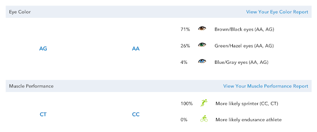
This is from our report at 23andme. It’s pretty cool that we can get this information at all – we are living in the future, in a time genetic sequencing is done for fun.
How can this be? If you remember back to high school biology class, it’s all about genetics. Brown is the dominant gene, so you need the recessive gene from both parents in order to get another eye color. There’s a good explanation of it here.
Even though my eyes are brown, I must have inherited the recessive gene from my mom. My wife has some European ancestry in her family tree, so it looks like that recessive gene was passed down generation after generation all the way to her.
If you don’t have 23andme, you can get a reasonable prediction with this tool from the Tech Museum:
http://genetics.thetech.org/online-exhibits/what-color-eyes-will-your-children-have
One other thing to note about a newborn’s eye color – you might not even know their eye color after they are born. Newborns often have gray-colored eyes, which change over time. No one told me this before my first daughter was born, so I was pretty surprised when she looked at me with those silvery gray eyes.
By the way, we are asking the internet to vote on the name of our baby boy! For each vote, $1 will be donated to Save the Children.
If you have a minute, please give us your vote.
Further reading about eye color in mixed populations:
http://www.plosgenetics.org/article/info%3Adoi%2F10.1371%2Fjournal.pgen.1003372
 Five years ago, I used a Google Form to ask friends, family, and random readers of my blog to