1. What does the money go toward?
For every $1 donated, Save the Children can provide one complete polio vaccination course for a child. Save the Children is an international children’s charity that works in many countries around the world, and we asked them to create a campaign for early childhood medical care. I think this is a really great cause to support because it is one of the most efficient ways to help with the amount of money we are able to give. My wife is a Pediatric Nurse Practitioner who has seen how important early childhood medical care is, first hand.
2. So, no matter what happens, you are going to use the top-voted name for your son?
I have been on the Internet waaaay too long to make a promise like that. We’re not going to burden our son with a name like Mr. Splashy Pants or Marblecake. We will definitely use the votes to narrow down our choices, and I am a big geek so I will be doing a bunch of statistical analysis too.
3. What’s the timeline?
The poll launched April 7th, we’ll be keeping it open for a couple of weeks. The baby is due May 19th.
4. What are the names?
You’ll have to go to the poll and vote to see them :)
5. How does my vote become a donation?
All you have to do is vote, and we’ll take care of it. Between my wife and I, a group of generous Googlers, and Google’s amazing employee matching program, we have pledges to donate up to $14,000. If we don’t get enough votes to “use up” all the pledges, I’ll let the Googlers who pledged above the vote amount decide if they’d like to still donate. You can also go to this OneToday campaign and contribute $1 of your own.
6. Are you crazy?
Actually, this worked surprisingly well last time. It blew up into a big sensation mostly by accident and overall the response was very positive. I’m an Anti-abuse Engineer at Google, so I was ready for a fair amount of spamming and abuse. It ended up being less than I expected – most people thought it was fun to vote and suggest names. I don’t know exactly how things will go once we launch, but I’m somewhere between “reasonably optimistic” and “uncomfortably excited.” I’m also really hopeful that many voters will decide to join us with a small donation of their own, so we can raise as much money to help children as possible.
7. What name won last time?
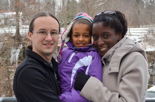
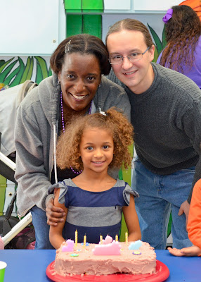
Olivia got the most votes, but we ended up naming our daughter Athena. Why? As we got 1000s of votes, I noticed that the order of names in our poll was becoming very similar to the order just by popularity in the previous year. That’s not very interesting, so I did a linear regression to find the names that were voted for more in my poll than could be explained by popularity in the U.S.
 Five years ago, I used a Google Form to ask friends, family, and random readers of my blog to