Tag Archives: information design

chartjunk heat maps hot spot how-to information-architecture information graphics Map App of the Day maps Mealographer photoshop tutorial Usability usability testing user-centered design

Propaganda Maps – Live, Interactive, on the Web

Before reading further, take a look at this impressive map web app from the Sri Lanka Ministry of Defence: http://www.defence.lk/orbat/Default.asp. Below is a screenshot of the main map.

Interactive map created by the Sri Lanka Ministry of Defence

What’s your initial impression? It’s certainly well-made. The graphic design is very professional, the map is interactive, allowing users to turn features on and get more detail. There’s also an animated timeline map of the recent conflict in the north that shows the progression of troops and photos from the various towns.

Continue reading

President Obama vs. Governor Jindal by Word Cloud

In the world of political blogging, the President’s speech before a joint session of Congress (basically a state of the union speech) is already ancient history, but I thought this was interesting enough to post. I’ve mused before on how word clouds and tag clouds can be useful – here’s a nice qualitative example.

Here’s a word cloud of President Barack Obama’s speech – major themes are apparent in large type, such as “economy” and “health.” You can also tell something about the urgency of the speech, with words like “now,” “new,” and “plan” showing up rather prominently.

Word Cloud of Obama's speech to Congress

Contrast with Louisiana Governor Bobby Jindal’s response, seen below. The three most dominant words are “Republicans”, which is understandable, “government” and “Washington.” I think this illustrates pretty clearly the thrust of Jindal’s speech, that the federal government can’t do anything right.

Word Cloud of Gov. Jindal's GOP response to Obama's speech

This isn’t a political blog but I do want to give a quick shout out to all the geologists out there who do important work like monitoring volcanoes. It’s ridiculous that Jindal, running a state that lives and dies based on natural disaster monitoring, would call out volcano monitoring as his example of pork spending.

Both word clouds made at Wordle.

Map App of the Day: Presidential Election Maps

It’s just two days until the U.S. Presidential election.  I thought I’d talk a bit about how elections are covered with information graphics, specifically maps.

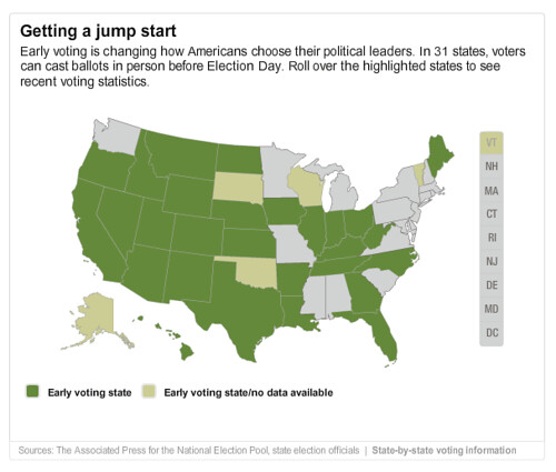
To get things started, CNN has has a map of early voting participation numbers.  For some states, they even have participation by party and by county.  This particular map is disappointing – no real effort is made to illustrate the information, all the real data is just text in callout boxes.  It might even be more efficient just to put the data in a big table like this page at George Mason University.

cnn-early-vote

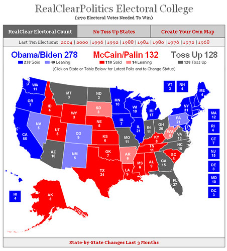
Real Clear Politics’ mapping application is interesting because it gives you to ability to run your own scenarios, switching swing states back and forth to see the result. You can also compare results from previous elections, all the way back to 1968.

real-clear-politics-map

But geographic projections don’t tell the whole story –  Political Irony has a great map demonstrating exactly why the Electoral College is a terribly undemocratic way to choose a president – voters in some states have effectively four times the influence of voters in others:

I’m not the first person to notice this of course, so there have been many efforts to show cartograms based on electoral pull.  There’s one at the Dispassionate Liberal and one at American Street, both using data from Pollster.com.

I like the analysis at FiveThirtyEight.com a little better, so I’ll show the latest cartogram from Frontloading HQ:

This map tries to keep the states in the right shapes, if they’re a bit disconnected.  Taking a cue from Michael Gastner, Cosma Shalizi, and Mark Newman at the University of Michigan, here’s a cartogram using the current data from FiveThirtyEight:

fivethrityeight election polling cartogram

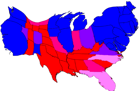
A couple of notes – Blue is safe for Obama, Red is safe for McCain.  I compressed “leans” and “likely” categories into one color because it’s late and my eyes are tired.  Also, I’m missing Alaska and Hawaii, I’ll try to find a base map that has them and update.

By the way, here’s another page with interesting maps of 2004 election results analyzed in a number of interesting ways.

I’m still on the lookout for the best map to watch election results as they come in on Tuesday – any suggestions?