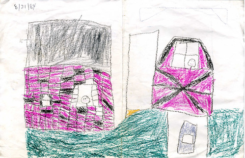
I recently came across something at my grandmother’s house – a drawing I made when I was five years old. Normally it would be more appropriate to post it on a refrigerator than a design and usability blog, but bear with me. The interesting thing about this crayon drawing is that it’s a representation of a real place – so we can see a little bit about how I saw my world at that age and how I tried to represent it.
Let’s look at this picture from three perspectives to find the good, the bad, and the ugly.
The Good – Information Design
First, how well does this image convey information to the viewer? Most of the time when we talk about information design we’re worried about accurate infographics, legible labels and structured documents. Since this image was intended to represent a real-world place we can look at it the same way.
Young me apparently had an eye for color and texture. The red and black brick makes the house immediately recognizable – I bet that if I handed it to a stranger and lead them to the right street, they would pick out my parent’s house immediately. The barn to the right was my dad’s large shed, and the color scheme and pattern of the beams is pretty accurate.
 When viewed as a thumbnail, it’s clear this image actually has a fair degree of information density – and this is years before I had read anything by Edward Tufte. The viewer gets a good number of identifying characteristics in a small space, including architectural style and building materials. I had even included a bit of topography (the barn is uphill from the house and front yard).
The Bad – Artistic Aesthetics
Now let’s look at it from a more artistic point of view. Aesthetics are subjective, so I like to take into account the intent of a piece if possible. For this drawing, accuracy is the most immediate concern. Not all art has to be photorealistic or even representative, but I have no doubt that young Jason was trying his hardest to draw the place exactly as it existed.
For an objective piece this has many errors and omissions. For example, my parents’ house does indeed have a door, a number of additional windows, and a garage. The house is a ranch and my guess is that the shape shown here was influenced by the boxy, generic house shape that shows up in cartoons and childrens’ books. The window in the barn was never actually there and the driveway shouldn’t reach all the way back to it, instead ending at the missing garage.
Note that everything is completely flat – there’s no notion of perspective. I can’t be too hard on kindergarten self on this point because even the Ancient Greeks and Romans never mastered linear perspective. It’s hard to believe, but the brilliant minds that designed and built the Parthenon did not understand that to accurately represent our three-dimensional world on a two-dimensional surface, parallel lines should converge toward one or more vanishing points.

The two human figures represented in the windows are trite, generic stick figures. They show no emotion or individuality, and are poorly executed compared to the house and barn. The green grassy ground ends abruptly to the left of the house leaving an unbalanced, awkward composition. Overall I would have to say that this work was a failure, with some consideration given for the limit of the medium and the spotty recall of my five-year-old brain.
The (Potentially) Ugly – Childhood Development
Now for the analysis that is a little too close to comfort – where does this artwork put young me on the timeline of childhood development? I remember getting a lot of praise for my drawings when I was little, but lately I’ve begun to notice that adults praise any mark a child puts to paper. Was the foundation of my self-worth built upon patronizing indulgence?
Psychology researcher Viktor Lowenfeld mapped out childhood drawing development into stages by age. Here’s a page illustrating some of the stages and here’s a great comparison between his stages and those of Betty Edwards of Drawing on the Right Side of the Brain fame.
Lucky for my inflated ego, 5-year old me falls comfortably ahead of the curve. The ground is defined as a flat line, and there’s a clear spacial relationship between objects. Colors reflect the real world, especially when you take into account the limited Crayola palette. This places 5-year-old me firmly in the Schematic stage of development, usually see at 7 to 9 years.
I should stop congratulating myself long enough to note that in this stage, size often reflects emphasis or importance. The barn is much larger in this picture than in real life, and the stick figures are small and deemphasized. Did the barn stand out in my mind simply because I spent most of my time in the back yard, or was it because that’s where my dad kept cool things like the sledge hammer and gas for the lawnmower? Are the people small and anonymous to fit the window spaces, or do they reflect some lack of social development?
 The group photo – that awkward assembly of a group of friends or colleagues trying their hardest not to look like they are posing while they violate each others’ personal space. For a long time I thought it was impossible to take a good group photo, or at least it required huge amounts of creativity in choosing a setting, angle, or lord help us, props.