Posts Tagged ‘Usability’

Academic Papers Blog expert-review information-architecture information design iphone maps Projects readability site-navigation usability testing user-task-analysis user experience design user interface design video Writing

Redesigning my home page, what do you think?

Sunday, August 2nd, 2009

A while back I wrote some early thoughts about redesigning my blog for usability. I haven’t had much time to work on my blog since then, but to be honest my homepage was in even more dire need of attention.

The design considerations for my home page are a little different from my blog – I don’t expect anyone to come back to my homepage again and again, looking for informative articles or useful info. The use case for the home page can be stated pretty succinctly: “who is this guy, and what does he do?”

I’m also operating under the design constraint of what I can get done while our 8-month-old is napping. This means a very simple layout – it takes time to come up with lickable web2.0 buttons and reflections. I’d like the page to be visually interesting, though, which is why I decided to use a big freaking photo in the background.

Normally I would try to avoid such a bandwidth-sucking design but bandwidth doesn’t seem to be the problem it used to be. I have some ideas on how to trim down the image size without impacting the design too much that I’ll share once I’ve got it up.

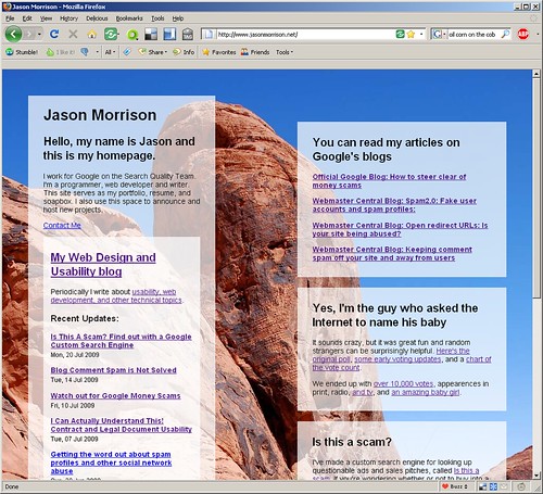
Here’s a screenshot of the first draft:

screenshot-1

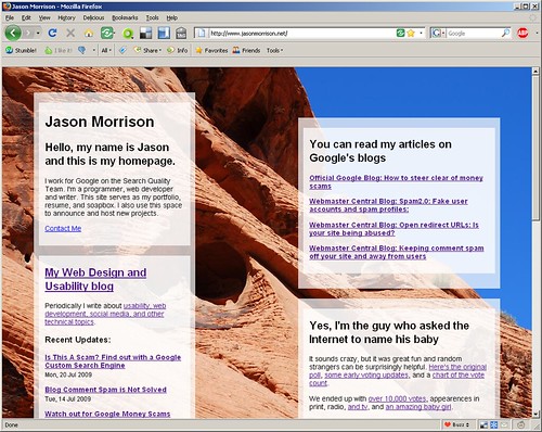
And here’s what it looks like, as of this post:

screenshot-2

What do you think? I’m specifically wondering:

  • Should I put a photo of myself on my homepage?
  • Any typography ideas? Right now everything is Helvetica (or Arial, if Helvetica isn’t installed).
  • The content boxes are floats, and they change position depending on the window size. Should I lock them down?

I Can Actually Understand This! Contract and Legal Document Usability

Tuesday, July 7th, 2009

How many times a week do you agree to some endless block of legal terms and conditions in order to access a website or install some software? How often does your phone company, stock broker, or credit card company send you changes to some contract in the mail?

Of those, what percentage of the time do you actually read and understand the blobs of tiny print?

I logged in to iStockPhoto for the first time in a while and was confronted by a change to the artists’ agreement. I was shocked, absolutely flabbergasted, to find the document clear and easy to read. I’m not sure this has ever happened before. I actually understood what they were talking about. Here’s a screenshot:

usable-legal-terms

A few pointers on how to construct a similarly user-friendly legal document:

  • Put a quick, “plain language” description at the top.
  • Highlight text changes by coloring the new sections and visibly crossing out the removed text.
  • Include convenient contact information at the bottom for further help and information. By convenient, I mean convenient for the reader, not convenient for your company.

Legal document usability is so bad at this point that I would advocate changing the law so that any terms document that didn’t meet the three point above would be automatically null and void. Kudos to iStockPhoto for getting it right.

User interfaces should be made as simple as possible, but no simpler

Monday, March 2nd, 2009

When designing a user interface or doing a usability review of an existing website, simplicity is an extremely important goal. When I get to your interface, don’t force me to spend time thinking. Make it easy for me to do what I want to do.

Here’s a perfect example: ever wish you had remote controls that looked like this?

simple remote control

Like anything else, though, don’t take the drive for simplicity and turn it into an inflexible dogma. Make sure your UI simplification efforts stop before your interface is:

… so simple it doesn’t give users any cues. This is a classic Web2.0 sandtrap – yes, your site looks very modern and clean with one giant button, but what does the button do?

… so simple it doesn’t do what the user wants. Here’s a great example of oversimplification from Tim and Eric Awesome Show:

It’s great – users have expressed frustration in getting calls when they’re at dinner or trying to enjoy a relaxing round of golf – so they’ve taken away the ability to get incoming call. Problem solved.

… so simple that important efficiency gains are lost, requiring users to expend repetitive manual effort. The Cinco Fone example above fits this one as well, but here’s another fun satire from the Onion News Network about the Macbook Wheel:

I’d love to hear any example of websites that you think might be committing one of the three sins of over-simplicity, please add a comment below.

Also, ff the title of this post is familiar, it’s because it’s based on a quote often attributed to Albert Einstein. The actual quote is:

It can scarcely be denied that the supreme goal of all theory is to make the irreducible basic elements as simple and as few as possible without having to surrender the adequate representation of a single datum of experience.

Usability and Design of WiFi Interstitial Pages

Wednesday, January 7th, 2009

You’re out somewhere, maybe a coffee shop or an airport.  Suddenly, a man falls to the floor – you need to know – what’s the antidote for tricyclic antidepressants*?  You grab your laptop or mobile and use the local WiFi to look up the answer -

Only to be annoyed and inconvenienced by the interstitial “terms and conditions” page that the coffee shop and/or airport redirects your browser to.  Time is of the essence!  Why do they need a 2-minute flash animation to load an “I agree” button?

Thus ends my attempt to make a relatively boring subject seem interesting.  In any event, I can’t be the only person who’s noticed that WiFi login or “terms and conditions” pages are often way more complicated and annoying than they need to be.

In the hope that someone, somewhere will do a quick search before implementing one and come across this blog, here are some guidelines.  These all follow logically from supporting the user’s goal, which is to get info quickly, and the business’ goal, which is to attract and keep customers.

Do not require Flash, ActiveX, or god forbid Silverlight.  Nothing you could want to do here could possibly require it, and there are lots of WiFi-enabled mobile devices that don’t have it.  Do you really want to poke a finger in the eye of every customer with an iPhone?  If we’ve already bought iPhones,  we obviously like spending money!

Make the checkboxes / buttons large enough to click on a small device.  So that people with touchscreen PDAs, Blackberries, iPhones and G1′s will be able to touch it on their screens.

Make the page and any server-side code fast.  Stay out of the user’s way as much as possible.  If your code can’t accept a form and do some logging without dragging a user’s browsing session to a crawl, you need to go yell at your devs.

Once users agree to terms, save it in a cookie for a reasonable amount of time. Many mobile devices don’t allow programs to run in the background, which means session cookies can expire every time the device dozes off.

Once users agree, redirect them back to where they were trying to go.  And use a real, server-side http redirect too, not a fragile javascript redirect.  Many people set up their browsers to ignore those.

Make the legal terms and conditions as readable as possible.  Readability is an interesting topic, with lots of research into measurement formulas and the like.  I think we can all agree that an iframe with 1700 words of legalease is not readable or useful.  And while we’re at it, why not add some actually useful information, like bandwidth limits, disabled protocols, etc.  If you are blocking POP and IMAP, let me know so I don’t waste time trying to check my email.

While the crazy scenario at the beginning of the post isn’t very likely, this isn’t just a list of gripes.  Why are you providing WiFi if not as a service to customers or a way to differentiate?  Well, coffee shops with WiFi aren’t very unusual anymore, so you should look at it as part of the who customer experience.

* Why did I pick tricyclic antidepressants?  I did a Google search for poison antidotes and picked the first one with an antidote I thought you might be able to find, in a mad rush to save a beloved minor character’s life, like in a TV show.

EDIT:  thanks to Wysz for pointing out the massive numbers of typos.

Web-based genealogy software – any recommendations?

Friday, January 2nd, 2009

Desperation This past year we moved away from most of my family and added a new leaf to the family tree.  This has inevitably turned my thoughts to family history.  As expected from a guy who let the internet vote for his baby’s name and Twittered the delivery, I’m not going to be happy typing up a plain old document and mailing it out to family members.

I want to start collating a family history and collecting stories, photos, and other artifacts and I want to do it with a web app so that I can share with family spread all around the country.  Though I don’t have time for any hard-core genealogical research right now I’d like to set up a good framework in case anyone else in family catches the bug and finds themselves hunched over microfiche at the local LDS church.

So two of my main concerns are usability and openness.  Openness means having complete access and ownership of the data (so Facebook family tree apps are out) and compatibility with standard genealogical file types.

It would also me nice if it were written in a language I know like PHP, Java, or even Python in case I get the urge to write plugins or change the interface.

I know of two systems that might fit the bill, PhpGedView and GeneoTree, but I’m hoping to get some suggestions and recommendations before I start installing lots of stuff on my web server.  Has anyone done a project along these lines, or played around with this kind of software?

Please leave any input in the comments below.

Bebo.com and Usable Social Networking Invite Systems

Saturday, November 22nd, 2008

Upside-down Jellyfish for an upside-down invite system An apology to anyone who got an unwanted invite to social networking site Bebo.

I tend to join and try out a lot of social apps as I run into them. I was signing up for Bebo when I got to the part of the process where you add friends to your account. First I saw the section I wanted, “Friends found on Bebo who are in your address book:

Next, there’s a section, “Friends of friends on Bebo who you MAY know:” I started down this list but noticed many duplicates from the first list. Normally this kind of duplication is a minor usability issue, since it wastes some screen real estate and a small amount of user attention. But in this case the duplicates were so prevalent I scrolled back to the top and clicked the “Add Friends” button.

Had I kept scrolling, I would have seen the “Invite friends to Bebo from your address book:” section with every email address checked by default.

Every social networking site has a feature like this, and it fuels the exponential growth that some of these sites experience. But sending an in-site friend invite is very different from sending a email invite. Most of us have email contacts who fall into various categories – friends, co-workers, people we’ve bought stuff from, former bosses, friends’ parents, etc. Very few people would want to actually send out invites to every single email address in their address book, so that should never be the default behavior.

So, yeah, sorry for the Bebo invite spam.

In other news, I just sent out over 3300 emails to people who voted in the baby name poll and left their email address.

Urban Usability – How walkable is your city?

Saturday, July 19th, 2008

Cleveland skyline from the Superior Viaduct I have a little project called Localographer, which you can use to create heat maps and find a house or apartment near your workplace, friends and relatives, or other place you’d like to be.  When I showed it to my brother he tried mapping out places in Boston and ran into a limitation – the interface doesn’t show you various transit options and it doesn’t make it easy to figure out the real cost and benefits of living in different places.

If you move to the suburbs, you might be able to commute by car but living by a train stop can be cheaper and easier.  In some neighborhoods you can get 10 different kinds of food in a 10 minute walk, in others you need to get in your car and drive a quarter mile to get anything to eat at all.

Adding features like this to Localographer means solving two problems – data and user interface.  I don’t have access to restaurant locations, transit stops, etc. and that sort of data can be expensive to get from commercial sources.  I could go the wiki route but that would require building an interface for users to contribute data and finding ways to make the data more reliable.

So in the mean time, if you want to get an idea of how walkable a potential neighborhood might be, take a look at Walk Score.  It’s a very cool site which has some of the features I’ve been meaning to add to Localographer – you can get a score for how livable the area around any address might be.

For example, my current neighborhood in California has a score of 74 out of 100.   Our house in Shaker Heights scores 62 out of 100.  Because any excuse is a good excuse to use a spreadsheet and a graph, I’ve plotted out the walkability of all the places I’ve lived using a Google Docs spreadsheet and the Interactive Time Series Gadget.  I wrote earlier about how you can embed any Google Doc or Spreadsheet into a blog post but Gadgets are even easier – just click the “Publish” button on the gadget and paste the Javascript code in the raw HTML view of your blogging software.

There are some issues with Walk Score, of course – for example Naples, Florida scores very high, but when I lived there I really missed having access to a car.  Most of the restaurants and shops along 5th Street and Tamiami Trail were out of my internship-funded price range.  I used to bike some distance to get to The Clock, a cheap diner.

All of this discussion is pointing toward a much larger question that I have been thinking about for a long time – I know how to study the usability of web sites and other software, but I wonder if anyone does usability studies of urban planning?  I’ve seen traffic flow studies and I know building codes have some basis in ergonomics and accessibility, but does anyone do observational studies of how people interact with different urban environments to figure out what works and what doesn’t?  Is there a Fitt’s Law of where to locate grocery stores compared to condos?

Problem with iPhone after 2.0 firmware update

Friday, July 11th, 2008

My wife tried to upgrade her iPhone to the 2.0 firmware this morning. Everything went fine until the phone got to the stage where it has icons telling you to lug into iTunes and the message “slide for emergency.”

Plugging in to iTunes gives us this message: “We could not complete your iTunes Store request. The network connection was reset.”

I finally found a thread on Apple’s discussion board with a workaround – keep the phone plugged in, and in iTunes, keep switching between the iPhone and another function like Music. You’ll keep getting the same error over and over, but supposedly it will work after a few minutes of trying.

After about 20 minutes of this ridiculousness (you can use the ‘m’ key and ‘i’ key to switch if you get tired of clicking), it finally looked like it was going through…

Only to tell me “iPhone activations are unavailable at this time.”

Clearly Apple underestimated demand, and their serves can’t handle the number of incoming requests. That isn’t much solace for my wife, who can’t use her phone today.

In the usability world, the technical term for this is “epic fail.”  We switched from Palm devices to the iPhone to avoid this sort of craziness.

I have to go to work. Guess I’ll try again later… anyone have any other workarounds?

Web Video Usability Review: South Park Studios

Monday, March 31st, 2008

After a few years of Youtube showing the world how to do video on the web, lots of traditional broadcasters and studios have started putting their content online. Part of the reason is to try to steal YouTube’s thunder – a more market-friendly tactic than just lawsuits. Many of these sites are trying to figure out an advertising model and make money, while others are obviously trying to get viewers more engaged by joining social networks, making mash-ups, etc.

But enough about their goals, what about user goals and experience? In web video the content may be king but usability is almost as important. If your user interface is difficult, confusing, or unpleasant, users will leave your site to get the content elsewhere.

So I’m going to try to do a usability review of various web video sites over the next few weeks. These won’t be formal reviews with user tests and cool eye-tracking heatmaps. Instead I’ll point out some user goals and hold up each site to the same rubrick.

The first site: SouthParkStudios.com

southpark-screenshot

So, what do users want out of web video? I can think of a number of scenarios: finding a particular clip or episode, watching recent episodes, sending a link to a friend or embedding a clip in a blog, and , well, just enjoying the show.

Selection

Score: 4 out of 4 points. This site has everything – every show from every season.

Finding Particular Videos

Method: I’m taking a cue from the creators of Friends – people don’t remember episode names. So I’ll be doing a Google search for the show name and “the one where” and taking the first relevant result. In this case it’s “the one where Ben Affleck has a relationship with Cartman’s Jennifer Lopez hand” (without quotes).

Score: 2 out of 4 points. The search fails, but a simpler query for “Ben Affleck” leads us right to the clips. The full episode is available.

Watching Videos

How easy is it to watch videos? What’s the quality?

Score: 4 out of 4. It’s immediately apparent what to click on to see an episode or clip. You can watch videos full screen and South Park’s animation lends itself well to compressed video. The navigation between episodes is pretty nice, with thumbnails of all episodes for that season along the bottom of the window.

Linking to Videos

Score: 3 out of 4 points. The URL for each clip and episode is available by clicking the “Share” button. Clips open up in the main window so if you can get the link like any other web page. The only lost point is the fact the episodes open in new windows – what is the point? It takes away my browser toolbar and any social bookmaking toolbars or extensions I might normally use.

Embedding videos

Let’s give it a try:

Score: 3 out of 4 points. Once again use the Share button to get the embed code. They lose a point for not allowing embedding of full episodes – they probably have good reasons for not wanting users to do so, but we’re only concerned about the user’s side of things right now.


Advertising

Score: 3 out of 4 points. Ads are shown before the video (for clips) or at two break points about halfway through (for full episodes). Commercials are short and don’t obscure video or interrupt the show more than normal TV commericals would. They lose a point, though, because of the lack of variety – I watched a few episodes and plenty of clips and only saw two different commercials, over and over again.

Audio Experience

I’m going in go with a slightly different scale this time: introducing the patented Bleeding Ear Scale of Web Video Volume.

You may have noticed that some TV stations play their commercials a little louder than the show. The theory I’ve always heard is that they want you catch your attention even if you get up to go to the fridge.

Score:

bleeding earbleeding earbleeding earbleeding ear

Unfortunately, most people don’t watch web video the same way they watch TV – they’re usually sitting much, much closer to the speakers or wearing headphones. The bone-shattering difference in volume between the video and the commercials on SouthParkStudios.com earned the site four bleeding ears.

Total score: 19 out of 24 points, with a special note to dive for the volume button whenever an ad is coming up.

The usability and design of two warning labels

Monday, January 14th, 2008

Usability and design aren’t just concerns for web developers.  They can make a real impact in the use and usefulness of physical products as well.

Warning labels are a great example – you can’t buy anything these days without some kind of warning label, and they are visual design elements intended to convey important information to buyers and users.  I ran into two great examples in the course of packing up and clearing out our house.

Example number one is from a big plastic storage tub.  It’s a great example of both usability and design, though the actual message might seem a bit silly.  Do people really need to be warned not to seal their children inside airtight containers?

A clear warning - do not store baby in plastic tub

It’s great from a design standpoint because it is clean, puts clear emphasis on the important diagram, and uses bright, attention-grabbing colors.  Any parents poised to place their toddler in the bin will not doubt see the label before recklessly replacing the lid.  It’s a good usability case because it conveys information very clearly and effectively-the silhouette kid is immediately recognizable and it uses common conventions such as the red circle and slash to mean “NO!”

The second example is…  well, strange and off-putting.  We might laugh at the thought of tupperwared toddlers but fireworks obviously pose some danger.  This series of warning messages from the back of a box of fireworks is, well…  take a look for yourself.  I recommend clicking on the image to zoom in in Flickr.

Strange fireworks warning label with creepy inhuman cartoon characters

So what could have been improved from a design standpoint?  For one thing, it would help if the coach and the two children in the second panel weren’t wearing what appears to be ghoulish, grimacing deathmasks.   They look like a cross between some misguided ventriloquist’s dummy and the clown that haunts the nightmares of every five-year-old child.  Cartoons caricatures can be very effective in warnings because we can remove unneeded visual detail to focus on what’s important and because people are accustomed to following short narratives in the style of comic strips.  But not if they are so ugly.

What are the usability problems?  Let’s start at the top.  The phrase “Common sense coach reminds you to…” isn’t quite as clear and gripping as “Warning: suffocation risk” in the first example.  The idea of using cartoons to illustrate each point is good, but the actual illustrations miss the point.  Without the text, do you think you could figure out the meaning of each of these?

For more examples of how usability and information design impact the real world, see The Design of Everyday Things by Don Norman.