A while back I wrote some early thoughts about redesigning my blog for usability. I haven’t had much time to work on my blog since then, but to be honest my homepage was in even more dire need of attention.
The design considerations for my home page are a little different from my blog – I don’t expect anyone to come back to my homepage again and again, looking for informative articles or useful info. The use case for the home page can be stated pretty succinctly: “who is this guy, and what does he do?”
I’m also operating under the design constraint of what I can get done while our 8-month-old is napping. This means a very simple layout – it takes time to come up with lickable web2.0 buttons and reflections. I’d like the page to be visually interesting, though, which is why I decided to use a big freaking photo in the background.
Normally I would try to avoid such a bandwidth-sucking design but bandwidth doesn’t seem to be the problem it used to be. I have some ideas on how to trim down the image size without impacting the design too much that I’ll share once I’ve got it up.
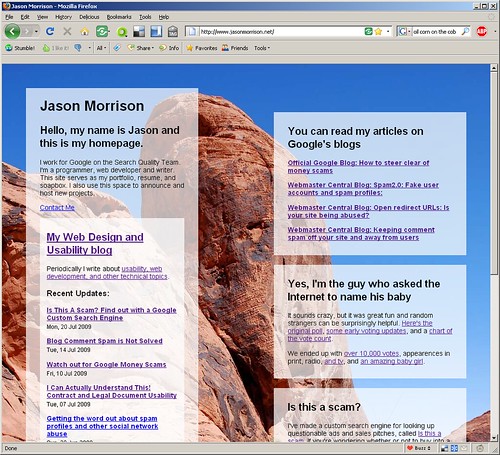
Here’s a screenshot of the first draft:
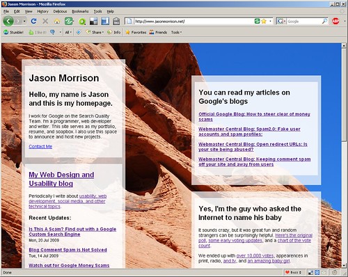
And here’s what it looks like, as of this post:
What do you think? I’m specifically wondering:
- Should I put a photo of myself on my homepage?
- Any typography ideas? Right now everything is Helvetica (or Arial, if Helvetica isn’t installed).
- The content boxes are floats, and they change position depending on the window size. Should I lock them down?
Running on FF 3.x the front page renders with the picture vertically aligned to the top, with black margins around it on the left/bottom/right. That looks kind of odd.
I opened up your Webpage with the left side of ‘favorites’ up, so your text boxes had to line up in one lane — had I not seen your screen shot here I would think you did that on purpose.
The background color and image are very nice.
The box of ‘recent posts’ could use space better — now the text is too long so the box took a lot of space.
“Is this a scam?” should be ensured to show up without scroll-down. That is an interesting work.
Maybe check some best practices of writing an informative abstract by F.W. Lancaster’s “Indexing and Abstracting in Theory and Practice”. Within limited length an abstract must eliminate redundancies and carry accurate yet most useful message, so readers will decide if to read the full paper based on the abstract.
OK, a non-designer’s comments.
Best, Marcia