Before reading further, take a look at this impressive map web app from the Sri Lanka Ministry of Defence: http://www.defence.lk/orbat/Default.asp. Below is a screenshot of the main map.
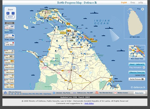
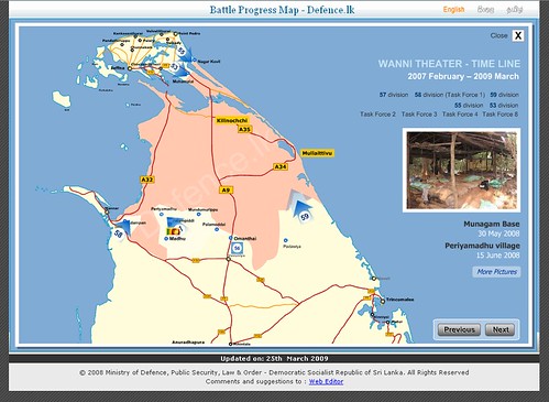
What’s your initial impression? It’s certainly well-made. The graphic design is very professional, the map is interactive, allowing users to turn features on and get more detail. There’s also an animated timeline map of the recent conflict in the north that shows the progression of troops and photos from the various towns.
The civil war in Sri Lanka doesn’t get much coverage in American press so a little background is appropriate. Suffice it to say that the separatist LTTE make a habit of bombing civilians but that the government has killed many and violated human rights as well. The war has been a major impediment to development in a country that could otherwise be called a tropical paradise.
What we see here is propaganda being marketed as transparency and access to information. I find it particularly interesting that the map makes the conflict look almost like a video game. You almost want to right-click on the armored units and send them into battle yourself. To gloss over the horrors of war, simply borrow the tropes from a medium that regularly turns fighting into fun and games.
Talking to a friend there, the map does indeed leave off important information about conditions:
The government is intimidating / murdering journalists, and keeping foreign media out of the conflict zones altogether. They don’t want people to know what they are doing over there, and try to rubbish any accounts that don’t match the official line. Most people are too stupid or too afraid to have a problem with this, or they don’t care as long as the war is won.
They have started setting up concentration camps (there’s no other word for it).
The fact that it’s propaganda doesn’t necessarily mean it’s inaccurate. Take for example this pre-WWII map published in Germany to show the danger of Czech bombing:

The issue isn’t the scale, or accuracy of distance measurements, the issue is the map is being used to sew fear and produce a desired effect in the populous.
Even maps without military themes can have a propagandistic effect. Wen I visited Argentina years ago I was struck by how many maps included both the Falkland Islands (understandable given the bitter conflict with Britain) but a pizza-slice of Antarctica as well. Here’s an early example, included in a postage stamp:

It’s probably easier to introduce the idea of invading a place (or planting oil rigs) if it has been on every map of the country everyone has seen since they were kids.
In my mind, there is a place for interactive, information-rich but slanted maps like this. Some information is better than no information, and at least here we know it’s from the government so we can make our own judgments. I just hope their visitors have enough context to take that into account and don’t instead see a successful endgame of Civilization III.