One of the best ways to show relationships in data is also one of the oldest: maps. There are lots of cool, fun visualizations out there like topic maps and tag clouds, but sometimes they emphasize form over function (and usability). Maps can be a great choice, even if your data is not directly geographical.
Here’s one example: a map of the United States showing where people use the terms “soda,” “pop,” or “coke.”

You might think this one was a pretty obvious choice, but you could definitely imagine someone using a pie chart to show the total percentages instead, throwing out a ton of information in the process.
Here’s one that’s a little more clever: a map of the United States, which each state labeled by a country with the same GDP. from strange maps.
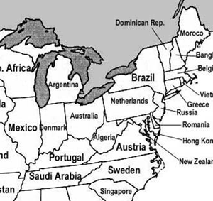
Now, you could argue with the precision of presentation since most people don’t know the exact GDP of Algeria off the top of their heads. But show them a table of figures and ten minutes later they still won’t know. This is a much more interesting and memorable presentation of the data.
One thought on “Data Visualization with Maps”
Comments are closed.