Tag Archives: user interface design

Academic Papers catalogs Google Docs GUI information design learnability Localographer oversimplification relational-databases search simplicity social networking structured search Usability video-games Walk Score Writing

User interfaces should be made as simple as possible, but no simpler

When designing a user interface or doing a usability review of an existing website, simplicity is an extremely important goal. When I get to your interface, don’t force me to spend time thinking. Make it easy for me to do what I want to do.

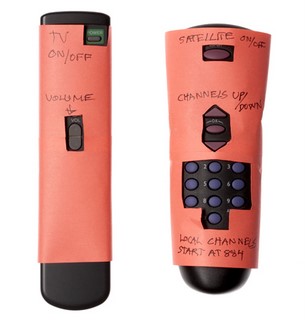
Here’s a perfect example: ever wish you had remote controls that looked like this?

simple remote control

Like anything else, though, don’t take the drive for simplicity and turn it into an inflexible dogma. Make sure your UI simplification efforts stop before your interface is:

… so simple it doesn’t give users any cues. This is a classic Web2.0 sandtrap – yes, your site looks very modern and clean with one giant button, but what does the button do?

… so simple it doesn’t do what the user wants. Here’s a great example of oversimplification from Tim and Eric Awesome Show:

It’s great – users have expressed frustration in getting calls when they’re at dinner or trying to enjoy a relaxing round of golf – so they’ve taken away the ability to get incoming call. Problem solved.

… so simple that important efficiency gains are lost, requiring users to expend repetitive manual effort. The Cinco Fone example above fits this one as well, but here’s another fun satire from the Onion News Network about the Macbook Wheel:

I’d love to hear any example of websites that you think might be committing one of the three sins of over-simplicity, please add a comment below.

Also, ff the title of this post is familiar, it’s because it’s based on a quote often attributed to Albert Einstein. The actual quote is:

It can scarcely be denied that the supreme goal of all theory is to make the irreducible basic elements as simple and as few as possible without having to surrender the adequate representation of a single datum of experience.
Bebo.com and Usable Social Networking Invite Systems

Upside-down Jellyfish for an upside-down invite system An apology to anyone who got an unwanted invite to social networking site Bebo.

I tend to join and try out a lot of social apps as I run into them. I was signing up for Bebo when I got to the part of the process where you add friends to your account. First I saw the section I wanted, “Friends found on Bebo who are in your address book:

Next, there’s a section, “Friends of friends on Bebo who you MAY know:” I started down this list but noticed many duplicates from the first list. Normally this kind of duplication is a minor usability issue, since it wastes some screen real estate and a small amount of user attention. But in this case the duplicates were so prevalent I scrolled back to the top and clicked the “Add Friends” button.

Had I kept scrolling, I would have seen the “Invite friends to Bebo from your address book:” section with every email address checked by default.

Every social networking site has a feature like this, and it fuels the exponential growth that some of these sites experience. But sending an in-site friend invite is very different from sending a email invite. Most of us have email contacts who fall into various categories – friends, co-workers, people we’ve bought stuff from, former bosses, friends’ parents, etc. Very few people would want to actually send out invites to every single email address in their address book, so that should never be the default behavior.

So, yeah, sorry for the Bebo invite spam.

In other news, I just sent out over 3300 emails to people who voted in the baby name poll and left their email address.

Urban Usability – How walkable is your city?

Cleveland skyline from the Superior Viaduct I have a little project called Localographer, which you can use to create heat maps and find a house or apartment near your workplace, friends and relatives, or other place you’d like to be.  When I showed it to my brother he tried mapping out places in Boston and ran into a limitation – the interface doesn’t show you various transit options and it doesn’t make it easy to figure out the real cost and benefits of living in different places.

If you move to the suburbs, you might be able to commute by car but living by a train stop can be cheaper and easier.  In some neighborhoods you can get 10 different kinds of food in a 10 minute walk, in others you need to get in your car and drive a quarter mile to get anything to eat at all.

Adding features like this to Localographer means solving two problems – data and user interface.  I don’t have access to restaurant locations, transit stops, etc. and that sort of data can be expensive to get from commercial sources.  I could go the wiki route but that would require building an interface for users to contribute data and finding ways to make the data more reliable.

So in the mean time, if you want to get an idea of how walkable a potential neighborhood might be, take a look at Walk Score.  It’s a very cool site which has some of the features I’ve been meaning to add to Localographer – you can get a score for how livable the area around any address might be.

For example, my current neighborhood in California has a score of 74 out of 100.   Our house in Shaker Heights scores 62 out of 100.  Because any excuse is a good excuse to use a spreadsheet and a graph, I’ve plotted out the walkability of all the places I’ve lived using a Google Docs spreadsheet and the Interactive Time Series Gadget.  I wrote earlier about how you can embed any Google Doc or Spreadsheet into a blog post but Gadgets are even easier – just click the “Publish” button on the gadget and paste the Javascript code in the raw HTML view of your blogging software.

There are some issues with Walk Score, of course – for example Naples, Florida scores very high, but when I lived there I really missed having access to a car.  Most of the restaurants and shops along 5th Street and Tamiami Trail were out of my internship-funded price range.  I used to bike some distance to get to The Clock, a cheap diner.

All of this discussion is pointing toward a much larger question that I have been thinking about for a long time – I know how to study the usability of web sites and other software, but I wonder if anyone does usability studies of urban planning?  I’ve seen traffic flow studies and I know building codes have some basis in ergonomics and accessibility, but does anyone do observational studies of how people interact with different urban environments to figure out what works and what doesn’t?  Is there a Fitt’s Law of where to locate grocery stores compared to condos?