Usability Testing
Usability tests can be seen to fall into two general categories, based on their aim: tests which aim to find usability problems with a specific site, and tests which aim to prove or disprove a hypothesis. This test would fall into the former category. A search of the literature will reveal that tests looking to uncover specific usability problems often use a very small number of participants, coming from Nielsen’s (2000) conclusion that five users is enough to find 85 percent of all usability problems. Nielsen derived this formula from earlier work (Nielsen and Landauer, 1993). Although there is much disagreement (Spool and Schroeder, 2001), this rule of thumb has the advantage of fitting the time and money budget of many projects.
Use of Eye-Tracking Data
In terms of raw data, eye tracking produces an embarrassment of riches. A text export of one test of Mealographer yielded roughly 25 megabytes of data. There are a number of different ways eye tracking data can be interpreted, and the measures can be grouped into measures of search and measures of processing or concentration (Goldberg and Kotval, 1999):
Measures of search:
- Scan path length and duration
- Convex hull area, for example the size of a circle enclosing the scan path
- Spatial density of the scan path.
- Transition matrix, or the number of movements between two areas of interest
- Number of saccades, or sizable eye movements between fixations
- Saccadic amplitude
Measures of processing:
- Number of Fixations
- Fixation duration
- Fixation/saccade ratio
In general, longer, less direct scan paths indicate poor representation (such as bad label text) and confusing layout, and a higher number of fixations and longer fixation duration may indicate that users are having a hard time extracting the information they need (Renshaw, Finlay, Tyfa, and Ward, 2004). Usability studies employing eye tracking data may employ measures that are context-independent such as fixations, fixation durations, total dwell times, and saccadic amplitudes as well as screen position-dependent measures such as dwell time within areas of interest (Goldberg, Stimson, Lewenstein, Scott, and Wichansky, 2002).
Because of the time frame of this investigation, the nature of the study tasks, and the researcher’s inexperience with eye tracking hardware and software, eye tracking data was compiled into “heat maps” based on the number and distribution of fixations. These heat maps are interpreted as a qualitative measure.
Methods
The goal of the study is to evaluate the usability of the web site and identify problem areas that might be improved.
Participants were solicited from a population of Kent State University graduate students in the School of Library Science (SLIS) and the Information Architecture Knowledge Management (IAKM) program via email. Five students volunteered, although one dropped out of the study at the last minute. Participants ranged in age from 25 to 35 with half female, half male. All had more than five years experience using computers and the web.
Participants were invited to the SLIS usability lab where they were informed of the procedure and asked for their consent. Once demographic data was collected, participants were calibrated on the eye tracking system and then asked to complete eight tasks using the web site. Participants were encouraged to “think out loud” while they attempted to complete each task, and their comments were recorded. Interaction with the web site was recorded by screen capture software and an unobtrusive eye-tracking device. Finally, participants were asked to fill out a short survey gaging their opinion of the site and it’s usability. Participants were free to stop at any time, and no incentive was offered for participation other than the opportunity to see the new lab and equipment.
Quantitative measures of usability include task completion, time required for task completion, and number of steps to completion. Participant comments and eye tracking data are used as qualitative measures.
Testing Difficulties
During the course of testing a number of problems arose with the eye tracking software, ClearView. At the conclusion of one of the four tests, the software locked up, making the computer unresponsive. Eventually it crashed, losing all test data for that participant. Consultation with a faculty familiar with the software confirmed that this is an unpredictable, but common bug in ClearView with no known workaround.
In addition, a deficiency was discovered in ClearView’s scanpath and hot spot visualization tools. Both overlay fixation data on top of screen shots of the web page the user was viewing. Unfortunately, the screen shots are not taken as the participant proceeds through each task. Instead the software remembers the URL of each page and then retrieves the screen shot at a later time. Many pages in Mealographer (and virtually any non-trivial web application) look different depending on whether or not a user is logged in, what the user has submitted in a form, and the presence or absence of cookies for session information. Therefore, many of the hot spot maps are laid over a version of the page dissimilar to what the participant had actually seen.
Findings
Task Completion Analysis
Overall, participants were able to complete the tasks 70% of the time. For the purpose of this evaluation, a task is considered complete only when the participant has found and used the expected feature for each task – often times, users were satisfied with their outcome, even though they had not used the most appropriate features. For example, two participants approached Task 1A by searching for a food they already knew was high in protein and low in fat, instead of finding and using the Healthy Food Search form. Table 1 displays the task list and completion rates. The tasks with the lowest completion rate were 1B, 6B, 7 and 8. It is interesting to note that the best-performing tasks include food search, meal entry, and user account functionality, which are the top items seen on the homepage when not logged it. This may be an indication of poor discoverability.
In general, the task completion rate indicates plenty of room for improvement.
| Task | Completion Rate | 1. A. Think of a food that you like. Use this website to find out how much protein is in that food. | 4/4 |
| 1. B. Try to find a food that is high and protein but low in fat. | 1/4 |
| 2. Please find your way back to the Mealographer homepage without using the browser’s Back button. | 4/4 |
| 3. Use this website to figure out how much fat and fiber you had at lunch today. | 3/4 |
| 4. Sign up for an account. | 4/4 |
| 5. Now that you have an account, please enter in what you had for breakfast today. How many calories did you have at breakfast? | 4/4 |
| 6. A. Did you have more Calories at breakfast or lunch today? Find a way to figure this out. | 3/4 |
| 6. B. Let’s say that you wanted to see a summary of your nutrition each day this week. Try to find a report that shows a week’s worth of information and look up your calcium intake. | 2/4 |
| 7. Let’s say you wanted to try to have more than 25 grams of fiber each day. What’s the best way to make sure that you are with this web site? | 2/4 |
| 8. If you were going to use this web site often, what would you do to make entering meals easier? If you can think of something, go ahead and do it. | 1/4 |
| Total | 70% |
Table 1: Task Completion
|
|
Completed Tasks |
Incomplete Tasks |
Number (recorded) | 19 | 11 |
| Average Time | 1:56 | 2:37 |
| Average Path Length | 3.79 | 6.27 |
Table 2: Task Completion vs Performance Measures
Note that for the three participants with recorded times per task and path lengths, completed tasks took less time and involved a shorter path (see Table 2). This is logical, but with only three participants the correlation is not significant.
Individual completion rates, average times per task, and average path lengths are given in Table 3 along with user ratings of the site from the post-test questionnaire. It is interesting to note that user performance on task does not seem to correlate with user ratings (although with so few participants, correlations would not be statistically significant). The user with the highest completion rate gave the site the lowest ease of use score and lowest score overall, while the highest rating was given by a participant in the middle of the field for each performance measure.
Overall, the user ratings of the site were positive, but not outstanding. Although the ratings don’t correlate to the measures, many of the specific usability problems noted later in this report were noticed by the participants themselves as they used the site. Presumably changes to correct these problems would result in higher ratings.
| Participant | Completion Rate | Avg Time per Task | Avg Path Length | Organization Rating | Ease of Use Rating | Design Rating |
| 1 | 4/10 | 1:33 | 2.9 | 4 | 4 | 3 |
| 2 | 6/10 | 3:35 | 8.0 | 3 | 3 | 4 |
| 3 | 10/10 | – | 3 | 3 | 3 | |
| 4 | 8/10 | 1:36 | 3.2 | 4 | 5 | 4 |
| Total | 70% | 2:15 | 3.7 | 3.5 | 3.75 | 3.5 |
Table 3: Participant Performance and Site Ratings
Table 4 shows the task time and path length for each recorded participant broken down by task. Except for tasks 2 and 8, target path lengths for each task were set to the smallest path that would achieve the goal plus one, and target task times were set somewhat arbitrarily to 2 minutes. Task 2 was much simpler than the other tasks and task 8 was open-ended, allowing participants to enter favorites, usuals, or both. It is difficult to set a task time goal for an interactive web site without data from previous tests. The amount of time a user might want to spend on a particular activity before becoming frustrated or giving up may very based on a number of factors including user motivation, user enjoyment, and web site stickiness. The target of two minutes was chosen because it was thought to be fairly aggressive, meeting the goal of the project to make diet tracking quick and easy.
| Participant 1 | Participant 2 | Participant 4 | Average | Target | ||||||
| Task | Time | Path | Time | Path | Time | Path | Time | Path | Time | Path |
| 1. A. | 1:10 | 3 | 1:55 | 4 | 1:33 | 4 | 1:33 | 3.67 | 2:00 | 3 |
| 1. B. | 0:38 | 1 | 1:29 | 4 | 1:11 | 2 | 1:06 | 2.33 | 2:00 | 3 |
| 2. | 0:08 | 2 | 0:17 | 2 | 0:17 | 2 | 0:14 | 2 | 0:30 | 2 |
| 3. | 1:56 | 3 | 4:35 | 3 | 2:17 | 4 | 2:56 | 3.33 | 2:00 | 4 |
| 4. | 1:18 | 4 | 1:19 | 4 | 1:56 | 5 | 1:31 | 4.33 | 2:00 | 4 |
| 5. | 1:25 | 3 | 4:56 | 3 | 2:53 | 3 | 3:05 | 3 | 2:00 | 4 |
| 6. A. | 1:51 | 3 | 5:26 | 14 | 1:52 | 4 | 3:03 | 7 | 2:00 | 3 |
| 6. B. | 1:23 | 3 | 5:59 | 15 | 0:36 | 1 | 2:39 | 6.33 | 2:00 | 2 |
| 7. | 1:16 | 4 | 3:29 | 8 | 1:30 | 3 | 2:05 | 5 | 2:00 | 5 |
| 8. | 2:48 | 3 | 6:20 | 23 | 1:58 | 4 | 3:42 | 10 | – | – |
| Total | 13:53 | 29 | 35:45 | 80 | 16:03 | 32 |
Table 4: Performance Measures by Participant
Items in Table 4 in bold denote tasks in which a participant had not met the target, and those with gray backgrounds represent successfully completed tasks. Looking at average performance, only tasks 1B and 2 completely met all objectives. It would be reasonable to look for specific usability problems in the tasks for which each participant missed one or more target, and many are addressed in the Specific Usability Problems section below.
Hot Spot Analysis
In Illustrations 5, 6, and 7, hot spot maps of the Mealographer home page are shown for three participants (one, two and four, respectively). These images show the relative number of fixations by color, with green meaning at least one fixation and red meaning three or more, with fixations length set to a maximum of 100ms.
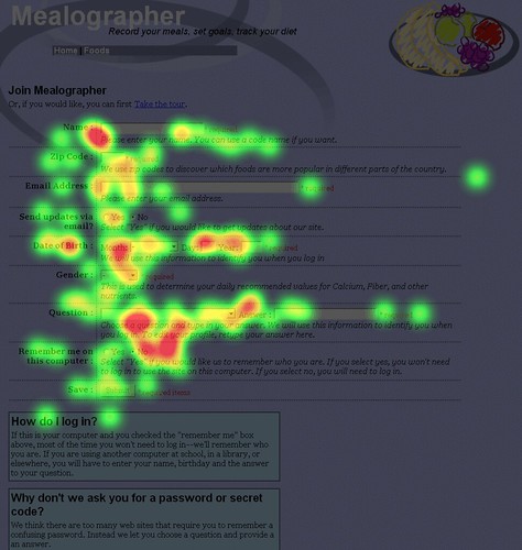
Illustration 5: Hot spot map for participant 1
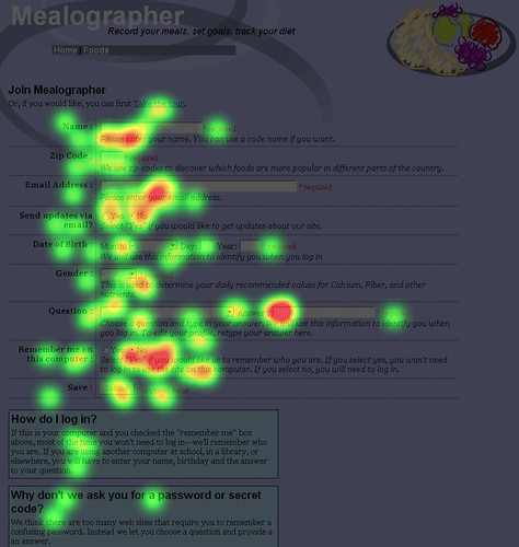
Illustration 6: Hot spot map for participant 2
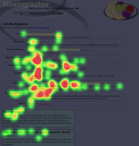
Illustration 7: Hot spot map for participant 4
These hot spot maps illustrate some of the observations that can be made with eye tracking that might be missed by other usability testing methods. For example, participant one did not read the light blue help boxes at the bottom of the page whereas two and four did. The participants fixated on many of the red “* required” labels, but only briefly – this may mean that they served their purpose in alerting users without causing confusion or additional concentration. Note the large red areas under the drop-down boxes for “Month” and “Question.” Users had to fixate more on these controls than on many of the text fields.
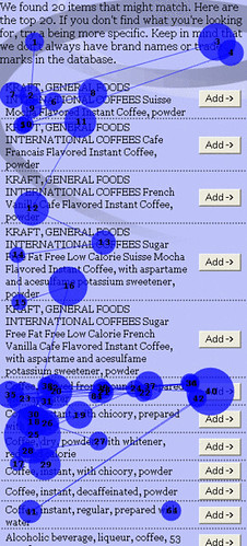
Illustration 8: Scanpath for participant searching for “coffee”
Illustration 9: Scanpath for expert searching for “tea”
Illustration 10: Scanpath for participant searching for “coffee”
Scanpath Analysis
The scanpaths in Ilustrations 8, 9 and 10 show the result of users entering in a search term on the meal entry form and searching for the proper item to add to their meal. The two on the left represent searches for “coffee” by two participants, novice users of the site. The one on the right is a search for “tea” by the researcher, and can be considered an example of expert use. Note that the paths of both novice users are both much longer than the expert, and that the convex hull area would be larger as well, despite the fact that the desired item is located in a similar position on all three. The novices need to gaze at each item on the list in order, and require more gazes on likely items in order to make a decision. In all three cases, the long, spread out gaze paths indicate that desired items are not near the top of the results, and are not readily apparent. Improvements should be made to the search engine and the results display, perhaps highlighting search terms within each line.
Specific Usability Problems
A list of specific usability problems has been compiled from the participant performance results in Table 4, observations made during the test by the researcher, and participant comments. Problems are organized by task.
Task 1A – Food search
Search results do not always match user expectations. Multiple participants expresses confusion or had to refine their search to get to the food they were looking for. As the tagging system grows, it will help to address this issue.
Search results are hard to scan. Participants seemed lost in all the text in the results. This can be addressed by highlighting the search terms within the results and visually dividing items from each other.
The ordering of nutrients on food pages might not be intuitive. The food pages were designed to match the ordering used on product packages, but some users needed extra time to find what they were looking for. One participant said she expected them to be in alphabetical order.
Task 1B – Healthy food search
Users did not notice the healthy food search function at first. Three users tried using the food search to search for a food they already knew was high in protein and low in fat, at least at first, and another was satisfied with the food he had just searched for by name. The healthy food search could be given more prominent placement, perhaps above the scroll on the search results page.
Task 3 – Meal entry using the quick form on the homepage
One user did not find the meal form on the homepage. Participant 1 used the food search instead, explaining that she had only had one thing to eat. Since the other found the form easily, action might not be needed to correct this.
Results for each food entered in the form do not match user expectations. One participant, for example, entered “rice” but did not find plain rice in the dropdown on the next page. This is another search engine difficulty.
Users could have refined their terms, but did not see a way to do so. In fact they would have had to go back to the homepage and submit the new terms. An entry box could be added to the results page to allow users to refine their terms.
Some users left some fields blank, and did not get useful results. One user left all the “Units” fields blank and the results showed a meal with no nutrition. It took some time for that user to figure out the cause of the problem. Validation hints could be added to the form, and units could default to one instead of blank or zero.
Task 4 – Account creation
Meals entered by visitors could be lost if they do not go directly to create a new account. One user missed the link to create an account from the meal page and went to the homepage first. This is a perfectly valid action. The ID of the temporary meal record in the database should be associated with the user session so visitors do not have to re-enter meals later.
Task 5 – Meal entry
It is not immediately clear how to use the meal entry form. Three users tried to click on the notepad at first, expecting it to work similarly to the quick meal form. Although both did figure out to use the search form to find and then add items, this could be improved. Currently when the form first loads, the search results frame is blank. An arrow graphic and some explanatory text might make use of this form more clear. It might also make sense to have only one meal entry form, mixing the strengths of each.
Users did not always try to modify search terms to improve results. At least one user suggested good modifiers when thinking out loud, but did not try any of them. There is text in the results that suggest trying again, but it could be made more clear.
Food search results were difficult to scan. Participants seemed to take a long time finding the item they wanted on the list (see Illustrations 8, 9, and 10 for scanpath diagrams). One participant suggested adding bullet points to better mark items in the list. Search terms could also be highlighted in the results.
Users are not sure how to enter complex or compound food items. One user tried “salad” and “caesar salad” but compound items with many variable ingredients like salads and sandwiches are left out of the database. Some instructions could be added. This might also be solved by the addition of a food or recipe entry system.
Some users left some fields blank, and did not get useful results. Like the quick meal form, validation hints could be added to the form.
Task 6A – Use of daily report
Some users didn’t think to look for a report system. Three users used pen and paper to compare meal totals instead, although two did later find the daily reports. The existence and functionality of the reports could perhaps be made more clear, and additional links might make the reports more discoverable.
Reports (and many other sections of the site) are not identifiable from browser history.
Participant 2 had a particularly difficult time finding the reports using the browser’s history function. Page titles were very similar, and he tried nine different links before trying another tactic. This is important because it means many pages would not make good bookmarks either. Better, more succinct page titles need to be used on interactive pages.
Reports cannot be accessed when not logged in. In the course of using the browser history, participant 2 accidentally logged himself out without noticing. This made it almost impossible to find the reports, and when he did find the reports they did not have any data. Care was taken to ensure users could not alter other users data, or make entries without logging in, but dynamic pages such as the reports should clearly remind users to log back in rather than displaying zeros. Once that is done links to the reports could be added to the tour page.
Task 6B – Use of weekly report
Users were not immediately aware of the weekly report. The control to switch to the weekly report is located below the scroll on the report page. It could be moved up or a simpler control could be added to the top of the page.
Task 7 – Goal creation
Users did not think to look for goal-setting functionality. Two users reported being happy just using the reports to track progress, though one later did find the goal functionality. Another user overlooked the link to create a goal at least once before finding it. Goals should be better integrated into the report pages.
The list of goals was confusing when no goals were listed. A new user looking at the list before entering sees the column headings but no indication that this is list with zero items. The list should not appear when no goals exist.
Some terms are unfamiliar to users. One participant did not know what “DRI” and “Daily Value” meant when entering a goal. Tooltips or links to a FAQ could be used to help inform users.
Task 8 – Use of usuals and/or favorites
The list of favorites was confusing when no favorites were listed. This is also true for usuals. The list should not appear when no favorites exist.
Favorites and usuals were not discovered by most participants. Three participants either did not think to look for such options or did notice them while using the site. Favorites and usuals need to be better integrated into the rest of the site. It might be helpful to indicate existence of favorites on meal page, even if user has no favorites. Also, an “add this food to my favorites” link could be added to food pages.
References Cited
Gibson, J. J. (1979). The Ecological Approach to Visual Perception. Hillsdale, NJ:Lawrence Erlbaum Associates.
Goldberg, J.H., Kotval, X.P., (1999). Computer interface evaluation using eye movements: methods and constructs. International Journal Of Industrial Ergonomics 24, 631–645.
Goldberg, J.H., Stimson, M.J., Lewenstein, M., Scott, N., Wichansky, A.M. (2002). Eye Tracking in Web Search Tasks: Design Implications. Proceedings of the 2002 symposium on Eye tracking research & applications. New York: ACM Press. pp. 51-58.
Golder, Scott A., Huberman, Bernardo A. (2006). Usage patterns of collaborative tagging systems.
Journal of Information Science, Vol: 32, Issue: 2, April 2006, pp. 198-208
Lindgaard, Gitte, Fernandes, Gary, Dudek, Cathy, and Browñ, J. (2006).
Attention web designers: You have 50 milliseconds to make a good first impression. Behaviour and Information Technology, Volume 25, Number 2, Number 2/March-April 2006, pp. 115-126(12).
Nielsen, Jakob. (2000). Why You Only Need to Test With 5 Users. Alertbox March 19, 2000. Retrieved May 15, 2006, from http://www.useit.com/alertbox/20000319.html
Nielsen, Jakob and Landauer, Thomas K. (1993). A mathematical model of the finding of usability problems. Proceedings of the SIGCHI conference on Human factors in computing systems. April 24-29, 1993, Amsterdam, The Netherlands. pp. 206-213.
Norman, Don. (2004). Affordances and Design. Don Norman’s jnd.org. Retrieved May 15, 2006, from http://www.jnd.org/dn.mss/affordances_and.html
Renshaw, J.A., Finlay, J.E., Tyfa, D., Ward, R.D. (2004). Understanding visual influence in graph design through temporal and spatial eye movement characteristics. Interacting with Computers. Vol: 16, Issue: 3, June, 2004. pp. 557-578.
Spool, J. and Schroeder, W. (2001). Testing Websites : Five Users is Nowhere Near Enough. CHI ’01 extended abstracts on Human factors in computing systems. New York: ACM Press. pp. 285-286.
Stafford, Tom and Webb, Matt. (2005). Mind Hacks: Tips and Tools for Using Your Brain. Sebastopol, CA:O’Reilly Media, Inc.
4 thoughts on “Formal usability testing with eye tracking – Mealographer”
Comments are closed.