Note: this report shows the results of a usability test of the Information Architecture and Knowledge Management program web site at Kent State University in 2003. The site has since been redesigned.
1. Introduction
In usability study of the IAKM web site I found a number of serious problems. Current IAKM students were asked to complete a series of tasks using the site. Although participants were able to complete the tasks 91.67 percent of the time, they met all performance goals for each task only 36.11 percent of the time. The site is not fundamentally broken, but clearly there is room for improvement. Through statistical analysis, observations of the students, and remarks made by the students a number of issues were uncovered.
Many of the problems were global problems with site navigation and labeling, but there were also a number of prominent local problems. The severity of problems were rated via three categories:
- Severe—prevents the user from completing a task or results in catastrophic loss of data or time.
- Moderate—significantly hinders task completion but users can find a work-around.
- Minor—irritating to the user but does not significantly hinder task completion. (Artim, 1).
Problems are also rated by scope. Any problem can be either global, meaning it applies to most pages or the site as a whole, or local, meaning it is particular to a page or specific section. Global problems are generally more pressing than local ones.
Findings are presented first in order of importance, followed by a description of the study methods.
Â
2. Findings
2.1 Users were only able to find the homepage link by accident.
Scope: Global
Severity: Moderate – Severe
Explanation: In the second task, users were asked to find their way back to the homepage without using any browser features (back button, typed URL, bookmarks, etc.). Although all were eventually able to do so, it took more than a full minute on average. Even the users who had the least difficulty doing so remarked that having the homepage link at the bottom of each page was counterintuitive. Participant E had particular difficulty with this task, first trying the navigation links at the top of the page. “It [about IAKM] is the first link on the left so generally its where you look for it [the homepage link],†she said, during the test. “Ah, interesting. It’s about IAKM, but it’s not the opening page.†She became frustrated when none of the links at the top of the page led back to home. “Oh! So I did a mouse over the IAKM logo, and I found something that says home. But it’s not an alt text and it’s only on mouse over. If I hadn’t been playing with the mouse I wouldn’t have detected it.â€
Participant S, who found the link quickly, was also disappointed. “Going back home was confusing: some pages had it on top, some on bottom.†He was referring specifically to the Student Project and Job Opportunities page, where the logo is on the top right of the page. Participant L agreed that “it should be on top.†Participant C, who knew where to find the link, said there was nothing else obvious to click on, but that if she hadn’t found it immediately she would have just typed in the URL.
Discussion: The convention on the web is to have a homepage link in the upper left hand corner of the page, usually in the form of a site logo. There’s nothing wrong with leaving this off of the homepage itself (Nielsen 2003), but global navigation bars should otherwise consistently have available (Rosenfeld 112) in the upper left hand corner (Krug 61). Although this is a moderate problem under the scale I’ve chosen, Nielsen rates this as a severe usability problem (Nielsen 1999).
Using a logo in the upper left also helps identify each of the pages with the rest of the site—although this was not part of this particular test, imagine finding yourself at the Student Resources page coming from a search engine. How long would it take you to figure out where you are, what IAKM is, or what college this is affiliated with? Many users know to “hack†off the end of the URL to get to the homepage (Nielsen 1999), but it’s still more time consuming and annoying than a clear homepage link.
2.2 Users are unable to find course information, and expect it to be in a central location.
Scope: Local
Severity: Severe
Explanation: In task 4, participants were asked to find information about a specific course (ECON 62015 – Economics of Information) that could only be found on the professor’s page for that course. Before going into test results I should mention that this task was somewhat difficult to formulate. I felt that users would likely look to the IAKM site for course information, but there are only links to three course pages and information about textbooks, etc. on only a few more. I specifically chose a course that was available, but had I chosen one at random participants would have had at best a one in ten chance of finding anything.
Despite the fact that I chose a course that was listed and half the participants had completed this task in the past, it still took participants on average 3 minutes, 37 seconds to complete the task with and average of 7 navigation errors. That’s just under the time goal, but well above the error goals. Results from Task 3 are also relevant to this issue. None of the participants achieved all of the goals for this task.
Participant E, for example, was able to find the list of available courses, but was confused at first. “If I wanted to find classes I would click on IAKM Program.,†she said. “They have a list of all the courses that are offered, but the list does not mention that they are available next semester or not, so they send you to another link to the student resources page.â€
Later when searching for the Economics of Information course, she ended up following a link from the Core Program page to a page in the College of Business Administration, but the course description wasn’t on the page. “So maybe the course is not offered anymore and that’s why it wasn’t in the business section either? I don’t know.â€
Discussion: It’s easy to see why course information might be decentralized and often lacking. With perhaps 30 or more courses available each semester, some with course web sites and some without, spread across a number of departments, updating all the links could be time consuming.
During the test, however, I observed participants clearly expecting to see a courses section on the navbar. Also, a content management system rather than static pages for the site could be used to keep course information centralized and updated.
2.3 Users are able to memorize how to find a specific page, but do not learn the site’s structure.
Scope: Global
Severity: Moderate
Explanation: Participants were asked to mention if they had performed each task on the IAKM site before, and to mention if they had seen the goal of a task while performing an earlier task. This means the results can be broken down into three categories: Old Tasks, which the user has completed before; New Tasks, which the user has not completed in the past; and Previewed Tasks, which the user has seen earlier during the test. From a look at Table 2.3.1 it’s obvious that users are better at tasks they have already completed than those they just previewed, and much better at either than tasks that are completely new to them in all measures except success rate. This means they were able to recall pages fairly well.
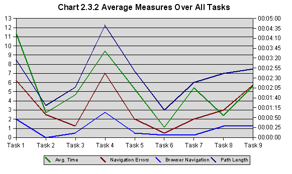
On the other hand, if users were learning the site’s overall organization, these measures should tend downward over time. As Chart 2.3.2 illustrates, however, there is no strong downward trend. Since I chose the tasks to be relatively equal in difficulty, this seems to indicate that users are not learning the site’s structure, but instead merely memorizing where certain information can be found.
| Table 2.3.1 Average Measures by Exposure to Task | |||
| Old Tasks | Previewed | New Tasks | |
| Avg. Time | 00:00:24 | 00:00:40 | 00:02:19 |
| Navigation Errors | 0.14 | 1 | 4.75 |
| Browser Navigation | 0.14 | 0.25 | 1.38 |
| Path Length | 3.14 | 3.25 | 8.25 |
| Success Rate | 85.71% | 100.00% | 87.50% |
Discussion: This illustrates both poor overall site organization and a classic moderate usability problem. It’s clear that the site organization is hindering users but that they are able to find a workaround—namely, their memory. The site is not particularly learnable. The graph shows a more or less random rise and fall in difficulty, despite the evidence that participants were paying attention to the site’s overall structure.
Users agreed after the test. Participant L said it was “difficult to tell what each section contained. Content needs to be arranged better.â€
“I believe that the current Student Resources page would be a useful addition to the front page,†Participant C said. “Most information on that page is useful for quick reference.â€
In addition to centralizing course information and breaking up the student resources page (mentioned below), the site’s overall structure should be reexamined with user goals and expectations in mind.
2.4 The site is not optimized for scanning, and users are more likely to scan pages than read them
Scope: Global
Severity: Moderate
Explanation: The strongest evidence for this finding was observing how participants actually used the site, but there is some statistical evidence as well. On average, participants spent only about 15 seconds on each page during the course of the test (since tests were run on a computer plugged into the university network, download times were negligible). Considering that some pages are fairly long (the Newsflashes page has about 1400 words, Student Resources page has over 1100, and the IAKM program page has almost 400) , and the average reading speed is around 250 to 300 words per minute (Bailey), it’s clear that users are not reading text but instead scanning for what they want. Note that the seconds per page values did not vary widely from task to task (Table ???), which means participants performed most tasks and browsed most pages with this similar scanning style.
| Table 2.4.1 Average Time Per Page (min:sec) | ||||
| Participant | L | S | E | Average |
| Task 1 | 00:14 | 00:20 | 00:26 | 00:20 |
| Task 2 | 00:19 | 00:04 | 00:15 | 00:13 |
| Task 3 | 00:18 | 00:12 | 00:29 | 00:20 |
| Task 4 | 00:06 | 00:12 | 00:16 | 00:11 |
| Task 5 | 00:08 | 00:13 | 00:23 | 00:14 |
| Task 6 | 00:07 | 00:07 | 00:15 | 00:09 |
| Task 7 | 00:07 | 00:19 | 00:24 | 00:17 |
| Task 8 | 00:08 | 00:09 | 00:19 | 00:12 |
| Task 9 | 00:13 | 00:12 | 00:28 | 00:18 |
| Average | 00:11 | 00:12 | 00:22 | 00:15 |
Even stronger evidence comes from actually observing participants. They were not very likely to read an entire page or even an entire paragraph, but instead hop around the page, using the scroll bar or scroll wheel on the mouse to pan down long pages. I also noticed a participants missing the desired text completely simply because they did not read the page. The first task, for example, asked participants to find the only Communication Studies professor in the IAKM program. Only two of the four participants found the correct professor, despite the fact that they all quickly found the Faculty and Staff page where this information is written. Some even tried reading each professor’s name and title down the list but gave up before getting to “Paul Haridakis, Ph.D. Communication Studies!â€
Discussion: It’s not hard to find literature that agrees that users scan rather than read. Krug explains there are three reasons why: users are in a hurry, they know they don’t need to read everything, and they are good at it (Krug, 22). His first suggestion for catering to this user habit is to create a clear visual hierarchy (Krug, 31), something the IAKM site needs to work at. The way to do this is through strong visual contrast. Williams puts it well: “To be effective, contrast must be strong—don’t be a wimp. If two elements, such as type, rules, graphics, color, texture, etc., are not the same, make them very different—don’t make them almost the same!†(Williams 118). The current site has page headings and subheads in a different color than body text, but the particular gold color does not attract attention more than black body text or red links. Also, headings are only a little larger than the rest of the text and subheads are the same size. With the large number of contextual links, important headers and lists get lost on the page.
2.5 The Student Resources page is too large
Scope: Local
Severity: Moderate
Explanation: The Student Resources page is large, covers a lot of ground, and was in general not very helpful to users. Tasks 3, 4, 5, 7 and 8 all involved this page in some way, and participants met all goals only 20 percent of the time vs. 56 percent for all others (Table 2.5.1). At the same time users were more likely to complete the task in the Student Resources tasks (95 to 81 percent). Aggregating so much information on just one page may help users find something eventually, but they won’t be able to find it quickly or easily.
| Table 2.5.1 Task Success Rates | |||||
| Participant | C | L | S | E | Average |
| Task1 | |||||
| Success | TRUE | TRUE | FALSE | FALSE | 50% |
| Met All Goals | TRUE | TRUE | FALSE | FALSE | 50% |
| Task2 | |||||
| Success | TRUE | TRUE | TRUE | TRUE | TRUE |
| Met All Goals | TRUE | TRUE | TRUE | FALSE | 75% |
| Task3 | |||||
| Success | TRUE | TRUE | TRUE | TRUE | TRUE |
| Met All Goals | FALSE | FALSE | FALSE | FALSE | 0% |
| Task4 | |||||
| Success | TRUE | TRUE | TRUE | TRUE | TRUE |
| Met All Goals | TRUE | TRUE | TRUE | FALSE | 75% |
| Task5 | |||||
| Success | FALSE | TRUE | TRUE | TRUE | 75% |
| Met All Goals | FALSE | FALSE | FALSE | FALSE | 0% |
| Task6 | |||||
| Success | TRUE | TRUE | TRUE | TRUE | TRUE |
| Met All Goals | FALSE | TRUE | FALSE | TRUE | 50% |
| Task7 | |||||
| Success | TRUE | TRUE | TRUE | TRUE | TRUE |
| Met All Goals | FALSE | FALSE | FALSE | FALSE | 0% |
| Task8 | |||||
| Success | TRUE | TRUE | TRUE | TRUE | TRUE |
| Met All Goals | FALSE | FALSE | FALSE | TRUE | 25% |
| Task9 | |||||
| Success | TRUE | FALSE | TRUE | TRUE | 75% |
| Met All Goals | TRUE | FALSE | FALSE | TRUE | 50% |
| Student Resources Tasks | |||||
| Success | 80% | 100% | 100% | 100% | 95% |
| Met All Goals | 20% | 20% | 20% | 20% | 20% |
| Other Tasks | |||||
| Success | 100% | 75% | 75% | 75% | 81% |
| Met All Goals | 75% | 75% | 25% | 50% | 56% |
While looking for details on the master’s project, Participant C first tried the IAKM Program section but ended up backing up and returning to Student Resources. “It would be useful if student resources was on the top section of links,†she said. “All the subsections are things students could use immediate access to. It seems like a good quick reference.â€
Participant E began skipping the anchor links at the top of this page completely. “I don’t know why I distrusted the first link. I started distrusting the site…â€
2.6 Users are unaware of what’s available on the site, even though they are very likely to use it to find information.
Scope: Global
Severity: Moderate
Explanation: In a pretest questionnaire participants were asked how likely they were to use a number of methods to find information about something in the program (a class, professor, requirement, etc.). The IAKM site tied with “Ask a classmate or professor†as the most likely information source (Table 2.6.1), and all reported having used the site in the past, monthly on average.
| Table 2.6.1 Participant Information Sources and Site Use | ||||||
| Participant | C | L | S | E | Average | S. D. |
| Likely to use… | ||||||
| IAKM Site | 5 | 5 | 4 | 5 | 4.75 | 0.5 |
| Kent Site | 3 | 2 | 4 | 5 | 3.5 | 1.29 |
| Catalog | 2 | 2 | 2 | 2 | 2 | 0 |
| Handbook | 2 | 1 | 4 | 2 | 2.25 | 1.26 |
| Ask | 5 | 4 | 5 | 5 | 4.75 | 0.5 |
| Used site before? | Yes | Yes | Yes | Yes | ||
| Frequency | Monthly | Weekly | Monthly | Yearly | ||
Participant S said “when looking for class lists/schedule I ended up elsewhere†and thought course descriptions were missing from the site altogether. He also had trouble with Task 5 for the same reason. “I don’t think there’s something specific on the site that tells you how many credits you have to take.â€
In Task 5 participant L only kept looking for a checklist because she knew SLIS had something similar. Later while searching for a professional organization, she was unsure. “It seems like it’s not here,†she said. “We’re not allowed to go external, off the site, are we? By now, I would have given up.â€
Discussion: This problem ties in with the site structure problems above, but it also speaks to a problem with labels. If links on the navbar and on each of the pages were made more clear, they might better suggest to users what resources are available.
3. Method
3.1 Participants
Participants were sought through word of mouth and a posting on the IAKM listserv and four IAKM students volunteered to participate in the test 4 December 2003. Students were offered a $15 gift certificate and the chance to help improve the IAKM site. In addition, some subjects expressed an interest in participating just to see what the test would be like.
Participants were all IAKM students who had used the site in the past. They were told to expect the test to take about an hour and all read and signed a form consenting to participation and audio taping. Testing took place in Library 310K (Prof. Haubitz’ office). See Table 3.1.1 for demographic information.
| Table 3.1.1 Demographics | ||||
| C | L | S | E | |
| Pretest | ||||
| Age | 23 | 32 | 30 | 33 |
| Gender | F | F | M | F |
| Concentration | IU | IU | IA | IA |
| Time in program | 1 | 1 | 2 | 1 |
| Status | Full-time | Full-time | Full-time | Full-time |
| Computer use (years) | > 5 | > 5 | > 5 | > 5 |
| Web use (yearrs) | > 5 | > 5 | 2 – 5 | > 5 |
| Used site before? | TRUE | TRUE | TRUE | TRUE |
| Frequency of use | Monthly | Weekly | Monthly | Yearly |
3.2 Test Procedure
Participants where given a pretest questionnaire to before the test (Appendix A). Once they arrived they were given the consent form to read and fill out and the procedure was explained. I gave each participant a test booklet (Appendix B) with nine tasks to follow. They were told to read the task, let me know when they were ready to begin, and stop when they had finished that task. Participants were also told to try to think out loud as they performed each task. At the end of the test I gave each a post test questionnaire (Appendix C).
3.3 Tasks
Task 1: You’re going to be taking an IAKM class with a Communication Studies professor. Find the professor’s name, email and office phone number.
Task 2: Please find your way back to the IAKM homepage without using the browser’s Back button.
Task 3: You’re getting ready to sign up for classes. Find a list of classes in the program next semester that you could use to choose the classes you want.
Task 4: You are taking ECON 62015 – Economics of Information, and you want to know what the lecture will be about this week. Find the course web page for that class and check the course outline.
Task 5: You would like to know how many more core credit hours you need in order to graduate. Find something on the site that would help you figure that out.
Task 6: You are about to graduate. Find two companies where you can apply for a job.
Task 7: You want to take a workshop next semester. Find the form you need to fill out in order to get credit for it.
Task 8: You are starting to think about your master’s project. Find some details and guidelines about what the project must contain.
Task 9: You are interested in talking to people working in knowledge management. Find some professional organizations dedicated to the field.
3.4 Task Measurement
Time goals: According to Nielsen//NetRatings, Internet users spend an average of 56 seconds on each page (“Affluent..â€) I took this figure to be a baseline measure of each task. I took the length of the shortest path to complete the task and multiplied it by 56 seconds per page. Note that this is a measure of mediocrity, not excellence; the idea is that the user will be able to complete this task within the time it would take them to complete any task on that number of pages. It is quite possible that the Nielsen//NetRatings data includes a much higher proportion of pages with news stories read from beginning to end, interactive pages, and other pages that should take longer to use than pages navigated in search of a specific piece of information.
Navigation Errors: Navigation errors were defined as following any link that did not lead to the location of the task’s goal. So if some information could only be found on the Student Resources page and the user first went to the About IAKM page, one navigation error would be counted. There was no way to estimate an average value before the test, so a goal of two or less was chosen for all tasks except task two, which had a goal of zero.
Browser Navigation: Any time the participant used a browser feature (including the Back/Forward buttons, bookmarks, URL field, Search in this page, etc.) it counted as one instance of browser navigation. Again, it was hard to find good estimates for this measure. Other studies have found rates of back button use varying from 3.3 to 15.9 percent of all user navigation actions (Herder). Since all tasks have path length goals of 4 or less, and assuming the site is well designed, users should not need to use these features at all. This goal was set to zero for all tasks.
Link and Other Errors: This category includes other errors including mistaking non-links to be links and any other mistakes with basic web functionality. The goal was set to zero for all tasks; since no errors of this type were recorded, this measure has been left out of the discussion.
Path Length: The path length is the total number of pages traversed in order to reach the goal. Anchor links to places on the same page were also counted toward the path length. The goal for each task was the shortest possible path from the homepage to the goal.
3.5 Results
See Table 3.5.1 for results.
| Table 3.5.1 Results | |||||||
| Goal | C | L | S | E | Average | S. D. | |
| Pretest | |||||||
| Likely to use… | |||||||
| IAKM Site | 5 | 5 | 4 | 5 | 4.75 | 0.5 | |
| Kent Site | 3 | 2 | 4 | 5 | 3.5 | 1.29 | |
| Catalog | 2 | 2 | 2 | 2 | 2 | 0 | |
| Handbook | 2 | 1 | 4 | 2 | 2.25 | 1.26 | |
| Ask | 5 | 4 | 5 | 5 | 4.75 | 0.5 | |
| Posttest | |||||||
| Organization | 3 | 3 | 4 | 3 | 3.25 | 0.5 | |
| Ease of Use | 4 | 2 | 4 | 3 | 3.25 | 0.96 | |
| Graphic Design | 4 | 4 | 3 | 4 | 3.75 | 0.5 | |
| Goal | C | L | S | E | Average | S. D. | |
| Task1 | |||||||
| Time | 00:01:52 | <1:52 | 00:00:27 | 00:01:18 | 00:11:21 | 00:04:22 | 00:06:04 |
| Nav Errors | 2 | 0 | 0 | 1 | 24 | 6.25 | 11.84 |
| Browser Nav | 0 | 0 | 0 | 0 | 8 | 2 | 4 |
| Link Errors | 0 | 0 | 0 | 0 | 0 | 0 | 0 |
| Path Length | 2 | 2 | 2 | 4 | 26 | 8.5 | 11.7 |
| Done Before? | TRUE | FALSE | FALSE | FALSE | |||
| Success | TRUE | TRUE | TRUE | FALSE | FALSE | 50.00% | |
| Met All Goals | TRUE | TRUE | FALSE | FALSE | 50.00% | ||
| Task2 | |||||||
| Time | 00:00:56 | <0:56 | 00:00:19 | 00:00:04 | 00:02:44 | 00:01:02 | 00:01:28 |
| Nav Errors | 0 | 0 | 0 | 0 | 10 | 2.5 | 5 |
| Browser Nav | 0 | 0 | 0 | 0 | 0 | 0 | 0 |
| Link Errors | 0 | 0 | 0 | 0 | 0 | 0 | 0 |
| Path Length | 1 | 1 | 1 | 1 | 11 | 3.5 | 5 |
| Done Before? | TRUE | FALSE | FALSE | FALSE | |||
| Success | TRUE | TRUE | TRUE | TRUE | TRUE | 100.00% | |
| Met All Goals | TRUE | TRUE | TRUE | FALSE | 75.00% | ||
| Task3 | |||||||
| Time | 00:01:52 | <1:52 | 00:01:29 | 00:01:27 | 00:02:27 | 00:01:48 | 00:00:34 |
| Nav Errors | 2 | 1 | 1 | 3 | 0 | 1.25 | 1.26 |
| Browser Nav | 0 | 1 | 0 | 1 | 0 | 0.5 | 0.58 |
| Link Errors | 0 | 0 | 0 | 0 | 0 | 0 | 0 |
| Path Length | 2 | 5 | 5 | 7 | 5 | 5.5 | 1 |
| Done Before? | TRUE | FALSE | FALSE | FALSE | |||
| Success | TRUE | TRUE | TRUE | TRUE | TRUE | 100.00% | |
| Met All Goals | FALSE | FALSE | FALSE | FALSE | 0.00% | ||
| Task4 | |||||||
| Time | 00:03:44 | <3:44 | 00:00:24 | 00:01:24 | 00:09:04 | 00:03:37 | 00:04:44 |
| Nav Errors | 2 | 0 | 0 | 2 | 26 | 7 | 12.7 |
| Browser Nav | 0 | 0 | 0 | 0 | 11 | 2.75 | 5.5 |
| Link Errors | 0 | 0 | 0 | 0 | 0 | 0 | 0 |
| Path Length | 4 | 4 | 4 | 7 | 34 | 12.25 | 14.57 |
| Done Before? | TRUE | TRUE | FALSE | FALSE | |||
| Success | TRUE | TRUE | TRUE | TRUE | TRUE | 100.00% | |
| Met All Goals | TRUE | TRUE | TRUE | FALSE | 75.00% | ||
4. Works Cited
“Affluent Americans drive Internet growth, according to Nielsen//Netratings.†Nielsen//Netratings. 15 October 2002. <http://www.nielsen-netratings.com/pr/pr_021015.pdf>
Artim, John M. “Definition: Usability Problem Severity Ratings.†Primaryview. Jan 2003. <http://www.primaryview.org/CommonDefinitions/Severity.html> (10 December 2003).
Bailey, Bob. “Free newsletter – HFI’s UI Design Update.†Human Factors International. August 2000. <http://www.humanfactors.com/downloads/aug00.asp> (10 December 2003).
Herder, Eelco. “Revisitation Patterns and Disorientation.†Department of Computer Science, University of Twente. 2003. <http://km.aifb.uni-karlsruhe.de/ws/LLWA/abis/herder.pdf> (10 December 2003).
Krug, Steve. Don’t Make Me Think. Indianapolis: New Riders Publishing. 2000.
Nielsen, Jakob. “Ten Most Violated Homepage Design Guidelines.†Jakob Nielsen’s Alertbox. 10 November 2003. <http://www.useit.com/alertbox/20031110.html> (10 December 2003).
Nielsen, Jakob. “’Top Ten Mistakes’ Revisited (Alertbox May 1999).†Jakob Nielsen’s Alertbox. 2 May 1999. <http://www.useit.com/alertbox/990502.html> (10 December 2003).
Rosenfeld, Louis and Peter Morville. Information Architecture for the World Wide Web. Stebastopol, CA: O’Reilly and Associates, Inc. 2002.