Tag Archives: site-navigation

Academic Papers Design expert-review First-Amendment graphic-design information-seeking-behavior information design Information visualizations learnability recommendation spatial maps tag clouds Usability usability testing user-task-analysis Writing

Word Clouds – what are they good for?

ReadWriteWeb had an interesting post showing word clouds generated from Barack Obama’s inauguration speech. 
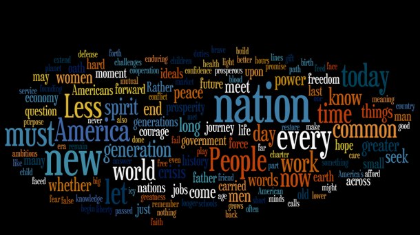
Obama Inauguration word cloud

But what are word clouds, and how are they useful? Word clouds visually represent the frequency or importance of a word in a given text. In President Obama’s speech, we can see from the cloud that he used words like “nation”, “new”, and “people” fairly often. You can use them to compare to texts in in a sort of qualitative way – does one text have a much sharper distribution than the other?

I would say that most of the time their primary purpose is aesthetic. I’m not convinced people really use them for anything other than as nice design elements – thought I think they have untapped potential. That’s why I created the Tag Altocumulus WordPress Plugin, to try to integrate tag clouds into a site’s navigation system in a way that’s actually useful.

To generate the clouds they used Wordle, a very cool site that lets you create your own word clouds from any text.  Wordle gives you options on color, font, and orientation and you can end up with some pretty nice looking clouds. I went ahead and generated one from my paper on Tagging and Searching:

Wordle: Tagging and Searching

It does look pretty cool. Wordle also will generate a cloud from any site with an RSS feed. Here’s the cloud for my site:

Wordle: Blog cloud

Drop me a note in the comments below if you make one for your site or find an interesting text to use.

Usability test of the Kent State IAKM home page

Note: this report shows the results of a usability test of the Information Architecture and Knowledge Management program web site at Kent State University in 2003. The site has since been redesigned.

1. Introduction

In usability study of the IAKM web site I found a number of serious problems. Current IAKM students were asked to complete a series of tasks using the site. Although participants were able to complete the tasks 91.67 percent of the time, they met all performance goals for each task only 36.11 percent of the time. The site is not fundamentally broken, but clearly there is room for improvement. Through statistical analysis, observations of the students, and remarks made by the students a number of issues were uncovered.

Many of the problems were global problems with site navigation and labeling, but there were also a number of prominent local problems. The severity of problems were rated via three categories:

  • Severe—prevents the user from completing a task or results in catastrophic loss of data or time.
  • Moderate—significantly hinders task completion but users can find a work-around.
  • Minor—irritating to the user but does not significantly hinder task completion. (Artim, 1).

Problems are also rated by scope. Any problem can be either global, meaning it applies to most pages or the site as a whole, or local, meaning it is particular to a page or specific section. Global problems are generally more pressing than local ones.

Findings are presented first in order of importance, followed by a description of the study methods.

  Continue reading

Information visualizations and spatial maps on the web – Usability concerns

Visualizing the web

Although web technologies are constantly changing, most users still browse the web the same way they did back in 1995–typing keywords into search boxes, clicking from home page, to section, to subsection on a navigation bar, or following link, to link, to link. The fact that it is called a “web” suggests that there should be other ways of navigating websites, and there are a number of projects attempting to employ information visualizations and spatial maps to do so.

All web pages organize information visually, but “information visualization centers around helping people explore or explain data that is not inherently spatial, such as that from the domains of bioinformatics, data mining and databases, finance and commerce, telecommunications and networking, information retrieval from large text corpora, software, and computer-supported cooperative work.” (“InfoVis 2003 Symposium”) Spatial metaphors are used to communicate different levels of information. A simple, static example would be a personal homepage built to look like the designers home, with links to favorite movies in the living room and recipes in the kitchen. A more advanced example would be a customer relationship management system for a large company which instead of presenting a list of technical support problems and solutions, displays an interactive map of problems, with more common problems in a larger font size, and recent problems in red. In both cases, users get an immediate grasp of complex information.

Such visualizations are intended to help solve two current web usability problems: the lack of a wide view to web structure, and the lack of query refinement based on relationships of retrieved pages (Ohwada 548). But they must do so without creating additional usability barriers. This paper will describe three current information visualization projects and describe some of the usability issues these sorts of projects face.

Continue reading