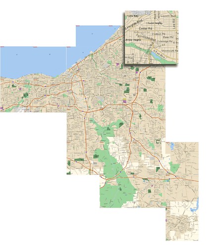
In part 1 we created a simple heat map in Photoshop to figure out which neighborhoods would be good places to look for a new house. But distance from work and school isn’t the only factor worth considering. We can always add more radial gradients to show proximity to favorite restaurants, family members, and the like. But that’s really just more of the same.
Think about the things that make a neighborhood a pleasant place to be – low crime, low pollution, parks nearby, friendly neighbors – some of those things can be quantified and mapped. We’ll have to wait for demographers to release official neighborhood friendliness metrics after the next census, but let’s see if we can find some of the other data.
Step 3: Highlight on-map elements
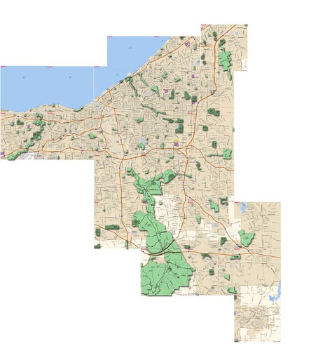
At least one of the new factors we want to look at is already available on our map – parks. All the parks on the map are in one of two shades of green. Use the Magic Wand Tool to select park areas and then Select -> Similar. You can see how I’ve selected the parks in the example below.
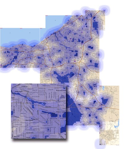
Now we’re going to do something similar to the concentric circles in step 2. Choose Select -> Modify -> Expand. You might have to play around with the number of pixels you expand by – for the scale I was working at, 20 pixels looked like close walking distance. Now use the fill tool with a low opacity to fill the area with the same color you used for the circles.
You can then repeat the expand and fill steps as many times as you like to build a heat map of park proximity. Don’t forget to change the blending mode to Multiply to match your other layers.
You can follow similar steps for other on-map elements, like shopping centers, college campuses, bodies of water – it all depends on what you like to be near and what’s available on your base map.
Step 4 – Pulling in data maps
First, a disclaimer: this isn’t a tutorial on how to automatically pull data from a server and have Photoshop map it for you (but keep watching my blog for a similar project in the future). Instead, we’re going to pull data maps from other places on the web and fit them over our heatmap.
The hardest part of this next step is finding the maps. The number and quality of maps available depends on your location, but in general the best two places to look are county and city websites and nearby colleges. If you don’t find what you’re looking for under “Maps” try looking for “GIS,” planning departments, or property information. Also, many government web sites have poor search systems – try doing a Google search with the site operator instead. For example, a search for Cuyahoga County might look like this: site:cuyahogacounty.us maps gis.
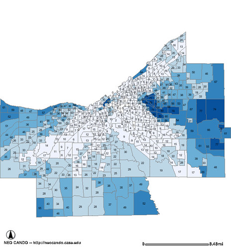
For this example, I’m going to grab a map from Case Western Reserve University’s NEO CANDO site. Another good source for the Cleveland area is the the Cuyahoga County Brownfields GIS server. My wife and I both have graduate degrees and we really value education – so I’m going to grab a map of the percentage of people with bachelor degrees or higher by census tract.
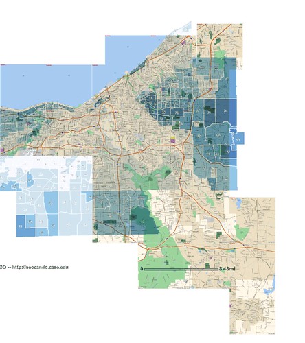
Now that we have a data map, we need to clean it up a bit and add it to our base map. Open the data map in Photoshop and use the Magic Wand tool to select the black and gray areas – the lines and numbers. Use Select-> Similar to make sure uoi have most of it selected and hit Delete. Now Select All, Copy and Paste it into your map as a new layer.
You’ll might want to use the Magic Wand and Select-> Similar again to clear out all the white area around the map and leave it transparent, but you don’t have to – you’re going to change the layer blending mode to Overlay like the other layers anyway. At this point, I can almost guarantee that the data map will be much smaller than your base map. Chose Edit -> Transform -> Scale to stretch it to fit. There’s no sure-fire way to do this, just keep stretching until you have a good fit to known boundaries like coastlines and major streets.
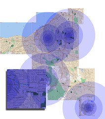
Here’s the result:
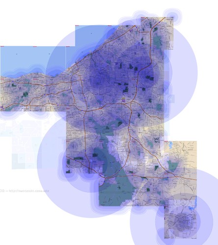
Step 5 – Bring it all together
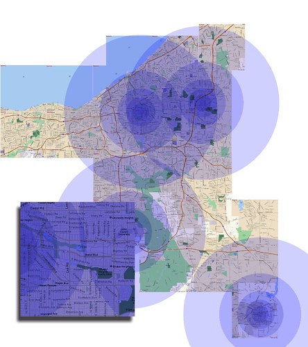
Now that we have all these different layers, it’s time to pull them all together in one heat map. You have a few options on how to do this. If you make all the layer visible at the same time your going to get a lot of very blue areas. Instead, try lowering the opacity of each layer based on who important it is to you. You can see an example of my Cleveland area map below.
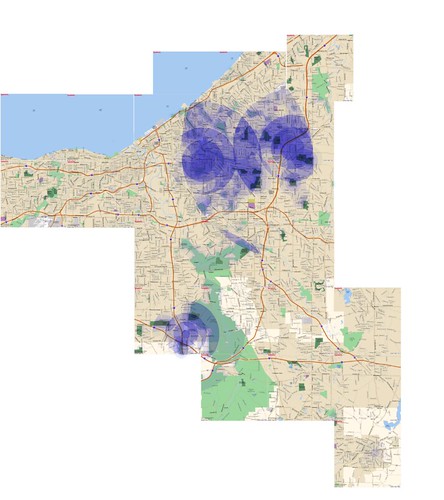
If you want to make the strongest areas of the heat map more visible, start by making your base map invisible while leaving all your other layers up. Go to Select -> color range and clikc the eye dropper on the darkest blue area you can find. Now increase the Fuzziness until it looks like the best areas are selected. Hit the OK button, create a new blank layer, turn off the rest of your layers, and fill the selection with your blue. You can see the result below.
Hopefully this has been helpful. You don’t have to make your map quite as involved as mine, and of course if you are looking in a smaller area you can constrain your map further.
Stay tuned for more updates on this topic. If you have a feed reader you can subscribe to my blog and if you’d like you can get email updates, too.
 Earlier I wrote about using Photoshop to create a heat map and to use data maps when house hunting. I got a pretty good response to those tutorials but the process is a little too labor intensive for most. So when I moved to California, I decided to do something similar, using the Google Maps API, so that it would be easy for anyone to make their own heat map.So here it is: Localographer – build interactive heat maps for house and apartment hunting. You can see a screenshot below:
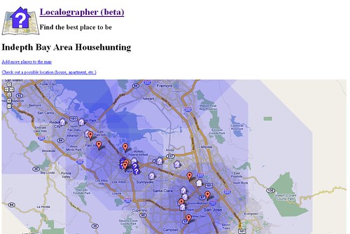 Localographer is a beta release right now, so watch out for bugs and random downtime. Also, I have to add a disclaimer: this is not an official Google project, this is something I did on my spare time. In fact, most of the work was done before I started working at Google in preparation for our move to California.The site takes you though a series of steps to build your map:
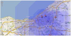
 In case you’re interested, the site was developed in PHP with a MySQL database. The maps use the Google Maps API with some hand-written functions to correctly draw the hot spots.Please take a look and let me know what you think. Post and problems, bugs, or new feature ideas in the comments below. Later I’ll post a poll so you can vote on new features and other enhancements.