Tag Archives: Map App of the Day

academic research election results Google Gadgets Google Maps Hurricane Gustav information design information graphics information richness journalism last.fm maps online-journalism open access poll storm maps tagging Usability web-development

Map Apps of the Day: Islands of Music and the Continental Zodiac

Two interesting uses of maps today, one is a completely non-geographical map that illustrtaes data while the other is a completely artistic use of geography.

Islands of Music

Last.fm is  a great service – I’ve written about it before.  The best thing about it is the copious and collection of interesting data on music tastes (you can even see how geeky your taste in music is).

Like many other web sites Last.fm has a tagging system, and so it interesting to see how different tags relate to each other – are hip-hop fans more likely to listen to ambient or heavy metal?  One very cool way to do this is with a map.
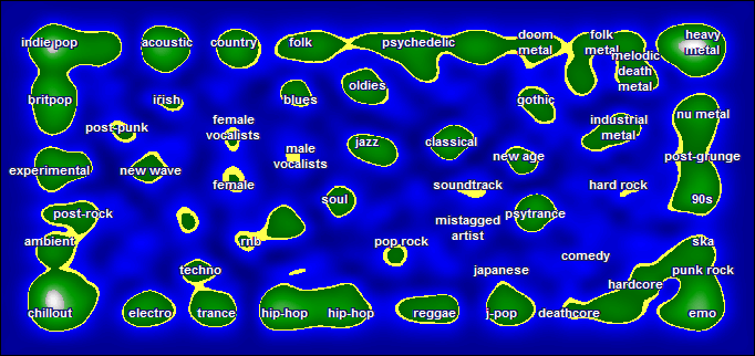
islands of music from last.fm

See the orginal version here, complete with mouseover descriptions of the different islands.  Visualizing music tatses as a map makes some interesting findings pop out – the long continent of folk, psychadelic, and metal in the northeast, for example.  Deathcore and emo are on the same continent, just on opposite sides of what I call You-Don’t-Understand-Me-Dad Bay.

This is an alternative to more conventional tag cloud or word cloud representations, though I’m not sure which presents information more clearly.

Another thing that strikes me is the similarity to video game maps – perhaps because of the iconic color palate.  Though we might think of them geographically, video game maps are equally artificial ways to relate to a big pile of numerical data.

World maps as Chinese zodiac

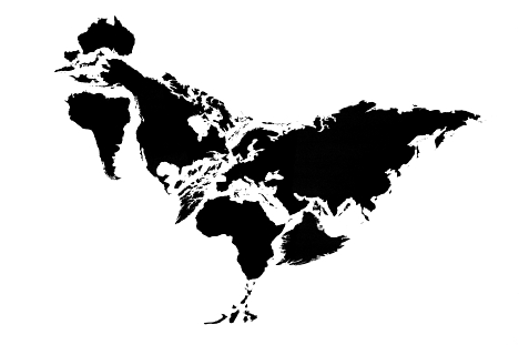
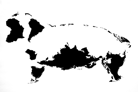
Artist Kentaro Nagai has used the continents (and major islands) as a medium to create the twelve signs of the Chinese zodiac.  See all of them here.

I particularly like the economy of arrangement in the rooster:
Rooster from Chinese zodiac

…and the sheep for it’s nice use of negative space.
The sheep from the Chinese zodiac

Thanks to Chris for the link to the Zodiac
Map App of the Day: Presidential Election Maps

It’s just two days until the U.S. Presidential election.  I thought I’d talk a bit about how elections are covered with information graphics, specifically maps.

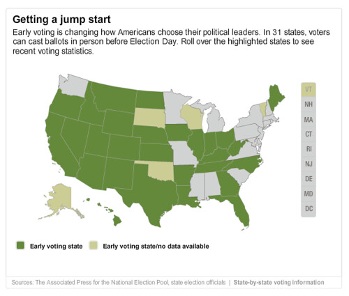
To get things started, CNN has has a map of early voting participation numbers.  For some states, they even have participation by party and by county.  This particular map is disappointing – no real effort is made to illustrate the information, all the real data is just text in callout boxes.  It might even be more efficient just to put the data in a big table like this page at George Mason University.

cnn-early-vote

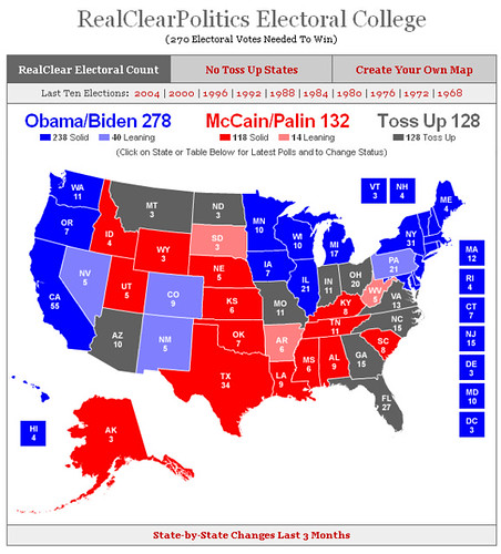
Real Clear Politics’ mapping application is interesting because it gives you to ability to run your own scenarios, switching swing states back and forth to see the result. You can also compare results from previous elections, all the way back to 1968.

real-clear-politics-map

But geographic projections don’t tell the whole story –  Political Irony has a great map demonstrating exactly why the Electoral College is a terribly undemocratic way to choose a president – voters in some states have effectively four times the influence of voters in others:

I’m not the first person to notice this of course, so there have been many efforts to show cartograms based on electoral pull.  There’s one at the Dispassionate Liberal and one at American Street, both using data from Pollster.com.

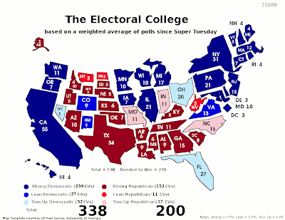
I like the analysis at FiveThirtyEight.com a little better, so I’ll show the latest cartogram from Frontloading HQ:

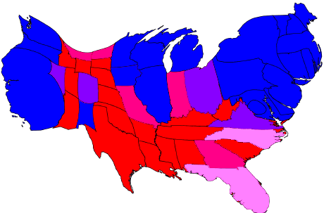
This map tries to keep the states in the right shapes, if they’re a bit disconnected.  Taking a cue from Michael Gastner, Cosma Shalizi, and Mark Newman at the University of Michigan, here’s a cartogram using the current data from FiveThirtyEight:

fivethrityeight election polling cartogram

A couple of notes – Blue is safe for Obama, Red is safe for McCain.  I compressed “leans” and “likely” categories into one color because it’s late and my eyes are tired.  Also, I’m missing Alaska and Hawaii, I’ll try to find a base map that has them and update.

By the way, here’s another page with interesting maps of 2004 election results analyzed in a number of interesting ways.

I’m still on the lookout for the best map to watch election results as they come in on Tuesday – any suggestions?