Tag Archives: Map App of the Day

academic research election results Google Gadgets Google Maps Hurricane Gustav information design information graphics information richness journalism last.fm maps online-journalism open access poll storm maps tagging Usability web-development

Map App of the Day: Tracking hurricanes with Stormpulse.com

Many years ago I spent a summer in Florida working for the Naples Daily News website.  One of my jobs was to keep the hurricane section up to date – so I scoured state, county and federal government sources and wire stories to find every informative map that I could get my hands on.  What we had available on the web back then pales in comparison to the information rich interface at Stormpulse.com.

Hurricane Gustav as seen from stormpulse.com

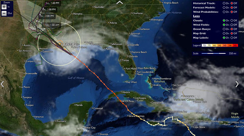
The screenshot above is from the site, tracking Hurricane Gustav as it climbs up Louisiana, just missing New Orleans.  It doesn’t take an information design expert to tell you that weather and disaster news can be expressed very effectively with maps.  Stormpulse does a particularly good job, pulling together data from various sources including satellite cloud cover maps, ocean buoy data, and a large number of forecast models.

The site also keeps some historical data on file, which was something I’ve found particularly perplexing when checking out storm maps in the past (I admit I’m a bit of a weather geek too).  Especially back in the days of pre-rendered maps, why wouldn’t you store everything and make it available to users?  Hurricanes might seem like very time-bound events, but they can cause profound changes in people’s lives that resonate for decades to come, and historical data can be useful in predicting future storms.

Another interesting thing to note is that they are not using the Google Maps API, which seems to be the go-to API for many web mapping efforts.  In fact they offer and API of their own, although it’s limited to embedding self-contained maps.

Map App of the Day: A genetic map of Europe

I’m a bit of a map geek and a big fan of using maps to convey information geographic and otherwise, so I’m starting a new series of posts – Map App of the Day.  I’ll highlight either a mapping web application or an application of mapping in information design that’s interesting, innovative, or just plain strange.

The New York Times had a brief article about a new study of genetic relationships between peoples in Europe.  The paper, by Lao et al., looked at genotype data from more than 2000 individuals spread throughout Europe.  The map on the right shows the normal geographic map of Europe, while the one on the left maps the genetic relationships between countries.

Here’s a link to a larger version on Current Biology’s web site.

The genetic map is a great example of why you should always consider mapping to illustrate data with a geographic component, and why you should always consider breaking the rules a bit  to get a good representation (most maps don’t show countries overlapping, for example).

This is also a great illustration of how permeable and impermanent national borders really are.  It would be interesting to see the same analysis done with distinctive populations like the Basque in Spain and the Sami in Finland added.

This also brings up with two non-mapping issues about journalism and research.  First off, the NYT article didn’t bother to actually link to the journal article, the researcher’s websites at their respective institutions, or any of the other places that readers would need to go to follow up on this paper or get more detailed information.  Why not?

Second, when I searched for Current Biology I was delighted to see that the journal publishes everything online, available via regular Google search, rather than hiding behind some expensive and proprietary publication database.  Open access is very cool.