The Cleveland Plain Dealer ran a story today about the origin of guns used in crimes in the city. This is an issue that people are concerned about and it deserves coverage. Rather than present information about gun laws in various states and numbers of crime gun recovered as a boring list, the PD provided a helpful infographic.
Maps and bar charts can be really useful tools to help people make sense of information. But look closely and you’ll see a problem – the bar chart showing the relative number of crime guns recovered is wrong:
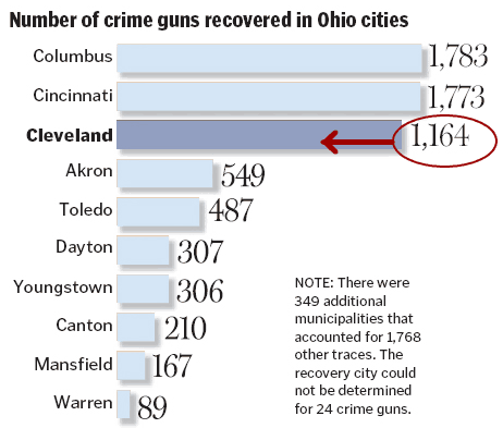
At first glance it looks like about as many guns are recovered from Cleveland as from Cincinatti and Columbus. But the Cleveland number is really about 65% of the Columbus number.
This is probably just an error, akin to misspelling someone’s name in an article. But it’s a good example of a bad graphic, sometimes called chartjunk. Ignoring the error, a bar chart like this might conceal more than it conveys. The top three cities are much larger than the rest, so wouldn’t we expect them to have more guns seized? Maybe a measure per 1000 persons would be better. We also need to think about what this chart implies to readers – is a higher number worse, because it correlates to more crimes, or better, because it means police departments are doing a good job of taking guns off the streets?
If you’re interested in reading more about how to design good graphics and communicate large amounts of data effectively, take a look at the books of Edward Tufte.