I recently ran across a couple of really great examples of how information can be conveyed dramatically with infromation graphics and one example of how to fix graphics that aren’t so good.
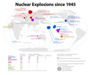
First, from the Radical Cartography project, a map of all nuclear explosions since 1945. This map encodes a lot of information fairly simply – we can see where nuclear tests have taken place, countries are indicated by color, and blast yield is indicated by size. Click on the image to see the full version.
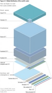
Next, from the United Nations Environment Programme’s Global Environment Outlook report, you can see a great illustration of how little of the world’s water is freshwater and how little of that is readily available in rivers and lakes. Click on the image to see the full-sized version.
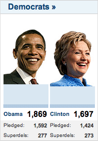
Why point out good example of information design? Because even the professionals get it very wrong a lot of the time. Bob Nystrom wrote a great post about how little information is presented in CNN’s chart of the delegate totals for Hillary Clinton and Barack Obama. Here’s their version:

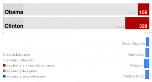
Without looking at the numbers, can you tell who’s in the lead? Can you tell how close the race is to the end? Do you read the bars left-to-right or up-and-down? Here’s Nystrom’s improvement:
Everything becomes clearer.
Got any good (or bad) examples? Post them in the comments below.


