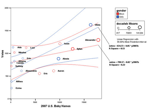
We’ve got well over 10,000 votes, we know that the vote totals are significantly different from random, so do we have enough information to pick a name yet?
There’s another stats exercise I want to go through before we narrow down the list. We want to pick a name that people have voted for, but we’d also like to choose a name that’s not too popular. This is just a personal preference that Ann and I have, we think it’s a little more fun to have a more unique name.
Also, it would be pretty boring if the vote gives us the exact same information as a list of most popular baby names. So, how to do we choose a name that’s popular with friends and family (and in our case, random internet strangers), that’s still reasonably unique?
Based on the chart below, names that fit our criteria include Ada, Cassia, Athena, Erin, or Olivia for a girl and Nikolas, Levi, Isaac, Dylan or Alexander for a boy. Follow along and I’ll explain where I got the data and how it helps me pick names.
Link to the full-sized graph at Flickr.
The graph you see above is a scatterplot of the names, showing the vote total versus the number of babies given that name in the U.S. in 2007. For example, Isaac has 1220 votes as of this writing and 10,066 babies were named Isaac in 2007.
