Tag Archives: information design

chartjunk heat maps hot spot how-to information-architecture information graphics Map App of the Day maps Mealographer photoshop tutorial Usability usability testing user-centered design

The usability and design of two warning labels

Usability and design aren’t just concerns for web developers.  They can make a real impact in the use and usefulness of physical products as well.

Warning labels are a great example – you can’t buy anything these days without some kind of warning label, and they are visual design elements intended to convey important information to buyers and users.  I ran into two great examples in the course of packing up and clearing out our house.

Example number one is from a big plastic storage tub.  It’s a great example of both usability and design, though the actual message might seem a bit silly.  Do people really need to be warned not to seal their children inside airtight containers?

A clear warning - do not store baby in plastic tub

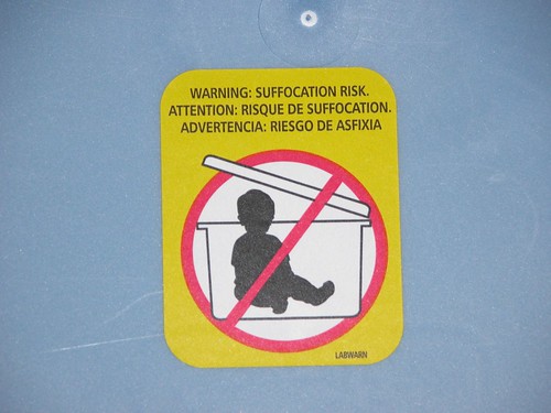
It’s great from a design standpoint because it is clean, puts clear emphasis on the important diagram, and uses bright, attention-grabbing colors.  Any parents poised to place their toddler in the bin will not doubt see the label before recklessly replacing the lid.  It’s a good usability case because it conveys information very clearly and effectively-the silhouette kid is immediately recognizable and it uses common conventions such as the red circle and slash to mean “NO!”

The second example is…  well, strange and off-putting.  We might laugh at the thought of tupperwared toddlers but fireworks obviously pose some danger.  This series of warning messages from the back of a box of fireworks is, well…  take a look for yourself.  I recommend clicking on the image to zoom in in Flickr.

Strange fireworks warning label with creepy inhuman cartoon characters

So what could have been improved from a design standpoint?  For one thing, it would help if the coach and the two children in the second panel weren’t wearing what appears to be ghoulish, grimacing deathmasks.   They look like a cross between some misguided ventriloquist’s dummy and the clown that haunts the nightmares of every five-year-old child.  Cartoons caricatures can be very effective in warnings because we can remove unneeded visual detail to focus on what’s important and because people are accustomed to following short narratives in the style of comic strips.  But not if they are so ugly.

What are the usability problems?  Let’s start at the top.  The phrase “Common sense coach reminds you to…” isn’t quite as clear and gripping as “Warning: suffocation risk” in the first example.  The idea of using cartoons to illustrate each point is good, but the actual illustrations miss the point.  Without the text, do you think you could figure out the meaning of each of these?

For more examples of how usability and information design impact the real world, see The Design of Everyday Things by Don Norman.

The information design and aesthics of five-year-old me

I recently came across something at my grandmother’s house – a drawing I made when I was five years old. Normally it would be more appropriate to post it on a refrigerator than a design and usability blog, but bear with me. The interesting thing about this crayon drawing is that it’s a representation of a real place – so we can see a little bit about how I saw my world at that age and how I tried to represent it.

Let’s look at this picture from three perspectives to find the good, the bad, and the ugly.

My house, according to 5-year-old me

The Good – Information Design

First, how well does this image convey information to the viewer?  Most of the time when we talk about information design we’re worried about accurate infographics, legible labels and structured documents.  Since this image was intended to represent a real-world place we can look at it the same way.

Young me apparently had an eye for color and texture. The red and black brick makes the house immediately recognizable – I bet that if I handed it to a stranger and lead them to the right street, they would pick out my parent’s house immediately. The barn to the right was my dad’s large shed, and the color scheme and pattern of the beams is pretty accurate.

My house, according to 5-year-old me When viewed as a thumbnail, it’s clear this image actually has a fair degree of information density – and this is years before I had read anything by Edward Tufte. The viewer gets a good number of identifying characteristics in a small space, including architectural style and building materials.  I had even included a bit of topography (the barn is uphill from the house and front yard).

The Bad – Artistic Aesthetics

Now let’s look at it from a more artistic point of view.  Aesthetics are subjective, so I like to take into account the intent of a piece if possible.  For this drawing, accuracy is the most immediate concern.  Not all art has to be photorealistic or even representative, but I have no doubt that young Jason was trying his hardest to draw the place exactly as it existed.

For an objective piece this has many errors and omissions.  For example, my parents’ house does indeed have a door, a number of additional windows, and a garage. The house is a ranch and my guess is that the shape shown here was influenced by the boxy, generic house shape that shows up in cartoons and childrens’ books.  The window in the barn was never actually there and the driveway shouldn’t reach all the way back to it, instead ending at the missing garage.

Note that everything is completely flat – there’s no notion of perspective. I can’t be too hard on kindergarten self on this point because even the Ancient Greeks and Romans never mastered linear perspective. It’s hard to believe, but the brilliant minds that designed and built the Parthenon did not understand that to accurately represent our three-dimensional world on a two-dimensional surface, parallel lines should converge toward one or more vanishing points.

Classic photo of the Parthenon

The two human figures represented in the windows are trite, generic stick figures.  They show no emotion or individuality, and are poorly executed compared to the house and barn.  The green grassy ground ends abruptly to the left of the house leaving an unbalanced, awkward composition.  Overall I would have to say that this work was a failure, with some consideration given for the limit of the medium and the spotty recall of my five-year-old brain.

The (Potentially) Ugly – Childhood Development

Now for the analysis that is a little too close to comfort – where does this artwork put young me on the timeline of childhood development?  I remember getting a lot of praise for my drawings when I was little, but lately I’ve begun to notice that adults praise any mark a child puts to paper.  Was the foundation of my self-worth built upon patronizing indulgence?

Psychology researcher Viktor Lowenfeld mapped out childhood drawing development into stages by age.  Here’s a page illustrating some of the stages and here’s a great comparison between his stages and those of Betty Edwards of Drawing on the Right Side of the Brain fame.

Lucky for my inflated ego, 5-year old me falls comfortably ahead of the curve.  The ground is defined as a flat line, and there’s a clear spacial relationship between objects.  Colors reflect the real world, especially when you take into account the limited Crayola palette.  This places 5-year-old me firmly in the Schematic stage of development, usually see at 7 to 9 years.

I should stop congratulating myself long enough to note that in this stage, size often reflects emphasis or importance.  The barn is much larger in this picture than in real life, and the stick figures are small and deemphasized.  Did the barn stand out in my mind simply because I spent most of my time in the back yard, or was it because that’s where my dad kept cool things like the sledge hammer and gas for the lawnmower?  Are the people small and anonymous to fit the window spaces, or do they reflect some lack of social development?

When graphics lie

The Cleveland Plain Dealer ran a story today about the origin of guns used in crimes in the city. This is an issue that people are concerned about and it deserves coverage. Rather than present information about gun laws in various states and numbers of crime gun recovered as a boring list, the PD provided a helpful infographic.

Maps and bar charts can be really useful tools to help people make sense of information. But look closely and you’ll see a problem – the bar chart showing the relative number of crime guns recovered is wrong:

pd-chart-error

At first glance it looks like about as many guns are recovered from Cleveland as from Cincinatti and Columbus. But the Cleveland number is really about 65% of the Columbus number.

This is probably just an error, akin to misspelling someone’s name in an article. But it’s a good example of a bad graphic, sometimes called chartjunk. Ignoring the error, a bar chart like this might conceal more than it conveys. The top three cities are much larger than the rest, so wouldn’t we expect them to have more guns seized? Maybe a measure per 1000 persons would be better. We also need to think about what this chart implies to readers – is a higher number worse, because it correlates to more crimes, or better, because it means police departments are doing a good job of taking guns off the streets?

If you’re interested in reading more about how to design good graphics and communicate large amounts of data effectively, take a look at the books of Edward Tufte.