Tag Archives: maps

election results Flickr Google Google Earth Google Maps heat maps hot spot how-to information design information graphics iphone Map App of the Day Photography photoshop tutorial Usability video-games

Google Earth vs. Reality, Revisited

Last week I compared some real-life photos with the same scene in Google Earth.  Since I’m a bit of a computer/mapping/photography geek, I couldn’t resist doing a few more.  That actually ended up being a pretty popular post, with thousands of pageviews, which just goes to show I’m not the only combination computer/mapping/photography geek out there.

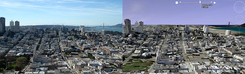
Here’s a view of San Francisco from Coit Tower on Telegraph Hill.  Follow this link to see larger versions in Flickr.  This one is even better than the two from last week – look how well the streets, buildings, and Golden Gate Bridge match with the photo.

Google Earth vs. Reality - San Francisco from Coit Tower

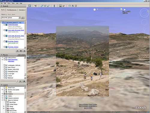
Now I’ll go a little more international.  Here’s a photo from the site of ancient Mycenae in Greece.  This is above the famous Lion Gate looking out tat the hills surrounding the Argolid plain.  See larger versions in Flickr.  The aerial photograph that Google Earth maps to the topography isn’t as detailed as the real life photo, but even the borders of the olive groves line up.

Google Earth vs. Reality - Mycenae, Greece

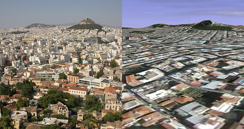
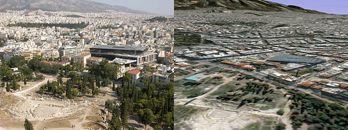
These next two are not as identical as the San Francisco cityscapes, but are still impressive because of how well they evoke the real life scenes without 3-d buildings.

The first is from the Acropolis in Athens, looking out over the surrounding neighborhood.  Larger versions in Flickr.

Google Earth vs. Reality - Athens from the Acropolis

Here’s another shot from the Acropolis showing the new Acropolis Museum.  Larger versions in Flickr.

Google Earth vs. Reality - Athens and the new Acropolis Museum

If you feel like making some comparisons of your own, please let me know in the comments below – I’d love to see what other people could come up with.

The Art of Information Graphics

I recently ran across a couple of really great examples of how information can be conveyed dramatically with infromation graphics and one example of how to fix graphics that aren’t so good.

First, from the Radical Cartography project, a map of all nuclear explosions since 1945.  This map encodes a lot of information fairly simply – we can see where nuclear tests have taken place, countries are indicated by color, and blast yield is indicated by size.  Click on the image to see the full version.

Next, from the United Nations Environment Programme’s Global Environment Outlook report, you can see a great illustration of how little of the world’s water is freshwater and how little of that is readily available in rivers and lakes.  Click on the image to see the full-sized version.

Why point out good example of information design?  Because even the professionals get it very wrong a lot of the time.  Bob Nystrom wrote a great post about how little information is presented in CNN’s chart of the delegate totals for Hillary Clinton and Barack Obama.  Here’s their version:

Without looking at the numbers, can you tell who’s in the lead?  Can you tell how close the race is to the end?  Do you read the bars left-to-right or up-and-down?  Here’s Nystrom’s improvement:

Everything becomes clearer.

Got any good (or bad) examples?  Post them in the comments below.

Announcing Localographer: find an apartment or house with Google Maps

Localographer logo Earlier I wrote about using Photoshop to create a heat map and to use data maps when house hunting.  I got a pretty good response to those tutorials but the process is a little too labor intensive for most.  So when I moved to California, I decided to do something similar, using the Google Maps API, so that it would be easy for anyone to make their own heat map.So here it is:  Localographer – build interactive heat maps for house and apartment hunting.  You can see a screenshot below:Screen shot of a Bay-area heat map from LocalographerLocalographer is a beta release right now, so watch out for bugs and random downtime.  Also, I have to add a disclaimer:  this is not an official Google project, this is something I did on my spare time.  In fact, most of the work was done before I started working at Google in preparation for our move to California.The site takes you though a series of steps to build your map:

  1. Pick your city and create your map;
  2. Add places you’d like to be near (like your job or your school);
  3. Add potential locations (houses, apartments, condos) to see how they compare.

I’ve got a ton of ideas for additional functionality, so hopefully I’ll have time to add more in the next few weeks.  I’ll also be working on the site’s design, making it a bit more usable and interactive.Here’s how a map in Localographer compares to my Photoshop heat map of the Cleveland area (click on the images to see larger versions):Screen shot of a Cleveland-area heat map from Localographer   Heat map we used for house hunting, with hotspots placed at locations we need to drive toIn case you’re interested, the site was developed in PHP with a MySQL database.  The maps use the Google Maps API with some hand-written functions to correctly draw the hot spots.Please take a look and let me know what you think.  Post and problems, bugs, or new feature ideas in the comments below.  Later I’ll post a poll so you can vote on new features and other enhancements.